
Digital Media Design · Bronx International High School
The Experience Path
A UX/UI Design Study Book
7 chapters · the real UX/UI process, start to finish
Digital Media Design · Bronx International High School
A UX/UI Design Study Book
“The Experience Path” is Book Six in this Digital Media Design series, written by a teacher at Bronx International High School for his own students and provided to them entirely free of charge. Unlike Books Three through Five, this book isn't aligned to a specific Adobe Certified Professional exam — there isn't one for UX/UI design, since Adobe's certifications are all tied to individual tools (Photoshop, Illustrator, InDesign). Instead, this book is organized the way real UX/UI work actually happens: research, ideation, wireframing, visual design, testing — and it builds directly on the wireframing and sitemap work already covered in “Paper First” (Book Two).
You are free to copy, share, print, and adapt this book, for any educational purpose, at no cost to anyone — on the following conditions: attribution required; non-commercial only; always free. Same license as every other book in this series.
This book teaches Figma as its primary hands-on tool, not Adobe XD. That's a deliberate, verified choice, not an oversight: Adobe placed XD into “maintenance mode” (no new feature development) after its planned acquisition of Figma fell through in late 2023, and Figma is now the real, current industry-standard tool most working UX/UI designers actually use. Teaching outdated tooling as current would be exactly the kind of error this series has corrected before (see The Digital Path's note on its own source material's out-of-date terminology) — so this book names that reality directly instead of building exercises around a tool that's no longer where the real industry is.
Every chapter below is written to real teaching depth — key terms, worked examples, hands-on exercises, review questions — and now illustrated with real screenshots captured directly from Figma. See the Sources & References section at the back of the book for full citations.
Chapter One
01
Two letters get confused constantly, even by people already working in the field — UX and UI are related, but they are not the same job, the same skill set, or the same question.
This chapter draws the real line between them, clears up the most common misconceptions, and connects this whole book to work you've already done in Paper First.
UX (User Experience) is the whole experience of using a product — can someone find what they need, understand what to do next, complete their goal without frustration? UI (User Interface) is the actual visual and interactive surface a person touches — buttons, colors, type, icons, layout. A helpful analogy: if a product were a restaurant, UX is the entire experience of the meal — how easy the menu is to read, how long you wait, whether the seating makes sense, whether you leave satisfied. UI is the plate itself, the table setting, the menu's actual typography — the visible, touchable details of that experience.
| UX (User Experience) | The complete experience of using a product, including how well it solves the user's actual problem — research, flow, structure, and usability, not just appearance. |
| UI (User Interface) | The visual and interactive surface of a product — buttons, layout, color, typography, icons. |
| Product Designer | A role that often combines UX and UI responsibility into one job, especially at smaller companies. |
| Interaction Design | The specific discipline of designing how a user interacts with a product — taps, swipes, transitions, feedback — sitting between UX and UI. |
A beautifully designed screen, with perfect type and color, is still a UX failure if the button a user actually needs is buried three menus deep, or the checkout process takes eleven steps instead of three. And a plain, visually unremarkable interface can still deliver excellent UX if it's fast, clear, and gets people to their goal with zero confusion. Neither one alone is the whole job — the strongest work does both together.
Think of one app or website you use often. Write 2 sentences about its UX (was your actual goal easy or hard to accomplish, and why) and 2 sentences about its UI (what specific visual/interactive choices did you notice — colors, buttons, icons). Then think of one app or website you actively dislike using, and do the same for it.
A few beliefs about UX/UI are common enough, even among people entering the field, to name and correct directly.
| Misconception | The reality |
|---|---|
| “UX just means wireframes” | Wireframing (Chapter 4) is one output of UX work, not the whole job — research and testing (Chapters 2 and 6) are just as core. |
| “UI just means making it pretty” | UI design is functional, not decorative — every color, spacing, and type choice needs to communicate meaning and guide behavior, not just look nice. |
| “You design for yourself” | Real UX/UI work is built around actual target users' needs and behavior, verified through research — not the designer's own personal taste. |
| “Good design is invisible, so it doesn't take much skill” | The fact that great UX/UI often goes unnoticed is a sign of how much deliberate work went into making it feel effortless, not a sign that it was easy. |
Pick one misconception from the table. Write a short (3-4 sentence) explanation, as if you were correcting a friend who believes it, using a specific real example to prove your point.
This book isn't starting from zero — you've already done real UX/UI thinking in Paper First's wireframe and sitemap-shorthand work, and in every Grade 9-12 critique day that used the “I notice / I wonder” protocol. This book goes deeper into the same skills, with real process and vocabulary behind what you've already practiced.
If you've built a rough wireframe sketch or a simple sitemap before, you've already done real information architecture and low-fidelity UX work — you just didn't have the vocabulary or process structure yet. Chapters 3 and 4 build directly on top of that existing skill, not from scratch.
Looking ahead: Chapter 2 starts where all real UX/UI work starts — not with a screen, but with actual research into who's going to use what you build.
Chapter Two
02
Real UX/UI work starts before any screen gets designed — with real questions about real people, answered through real research, not assumptions.
This chapter covers why research comes first, and the core tools UX designers use to keep a real user's actual needs in view throughout a whole project: personas, empathy maps, and journey maps.
It's tempting to jump straight to designing a screen — it feels like real progress. But designing before understanding who you're designing for is exactly how products end up solving the wrong problem, confidently and beautifully.
| User Research | Systematically gathering real information about actual (or realistically representative) users before designing — interviews, surveys, observation. |
| Qualitative Research | Research that gathers deep, descriptive insight from a smaller number of people — interviews, open-ended survey answers. |
| Quantitative Research | Research that gathers numeric, measurable data from a larger number of people — usage statistics, survey ratings. |
| Assumption | A belief about users that hasn't actually been verified through real research — the thing good UX research exists to replace. |
One of the most common early-career mistakes: designing based on how the designer themselves would use a product, rather than how the actual target users do. A teenager designing for retirees, or a technical person designing for someone brand-new to computers (a genuinely relevant example from this very curriculum's own tech-basics content), needs real input from that actual audience — their own instincts about "the obvious way to do this" are not a substitute.
Pick a real app or tool you know well. Write 3 interview questions you'd ask someone who has never used it before, to understand their expectations and confusion points before they even open it — questions that dig into their goals and mental model, not just "do you like it."
A persona is a fictional but research-grounded representative of a real user group — a tool for keeping an actual type of person in mind throughout a project, instead of designing for an abstract, faceless "everyone."
| Persona | A fictional character built from real research, representing a key user group's goals, behaviors, and frustrations. |
| Primary Persona | The main user group a product is being designed for, when a project needs to prioritize between several. |
| Goals | What a persona is actually trying to accomplish using the product. |
| Pain Point | A specific frustration or obstacle a persona currently experiences, that good design should address. |
A real persona is built from research (interviews, surveys, real usage patterns) — it's a way of organizing and communicating what was actually learned about real users, not a substitute for doing that research in the first place. A persona invented purely from imagination, with no research behind it, doesn't do its actual job.
Build one persona for a school app that helps students find their class schedule. Give them a name, age, one specific goal, and two specific pain points with how schedules are currently shared. Base it on someone real you actually know (with permission, or a realistic composite) rather than a generic invented stereotype.
Two more tools for keeping a real user's actual experience visible throughout a project, from two different angles.
| Empathy Map | A four-quadrant diagram (Says, Thinks, Does, Feels) capturing a user's real attitudes and behavior at one specific moment. |
| Journey Map | A step-by-step timeline of a user's entire experience using a product or completing a task, noting their feelings and pain points at each step. |
| Touchpoint | Any specific moment a user interacts with a product or service along their journey. |
Mapping a full journey — not just the moment someone uses the app, but before (why did they open it?) and after (what happens once they're done?) — often reveals that the most frustrating touchpoint isn't inside the product at all. A student journey-mapping "finding my class schedule" might discover the real pain point is that the school website itself is slow to load on the school's own WiFi, before the student ever gets to the actual schedule screen — a problem no amount of screen redesign alone would fix.
Using your persona from 2.2, draw a simple journey map for them finding their class schedule: at least 5 steps, from "realizes they need their schedule" to "has the information they need." For each step, note one word describing how they likely feel (confused, relieved, annoyed) and mark the single worst step with a star.
Looking ahead: Chapter 3 takes everything learned in research and turns it into real structure — sitemaps, user flows, and the ideation process, building directly on Paper First.
Chapter Three
03
With real research in hand, this chapter turns understanding into structure — how a product's content and screens get organized so users can actually find what they need.
Covered here: framing design problems as opportunities, building sitemaps and user flows (extending Paper First's sitemap-shorthand work directly), and card sorting as a real research method for structure itself.
Once research surfaces a real problem, UX designers often reframe it as a “How Might We” (HMW) question — a deliberately open framing that invites many possible solutions instead of jumping straight to one.
| How Might We (HMW) | A question format that reframes a user problem as an open invitation to brainstorm solutions, rather than a yes/no or single-answer question. |
| Problem Statement | A clear, specific summary of the real problem being solved, grounded in research, before ideation begins. |
| Ideation | The structured brainstorming phase where many possible solutions get generated before narrowing down to one. |
Chapter 2's journey-map pain point — "the school website is slow on the school's own WiFi before a student even reaches their schedule" — turns into: "How might we help students access their schedule quickly, even on a slow connection?" That framing doesn't presuppose the answer is "build a faster website" — it opens the door to genuinely different solutions: an offline-capable app, a text-message schedule lookup, a printed weekly copy. Good HMW questions stay open on purpose.
Using your journey map's starred worst step from Chapter 2, write an HMW question for it. Then brainstorm 5 genuinely different possible solutions — not 5 small variations of the same idea.
You've built sitemap shorthand in Paper First already — this section formalizes that skill with its real UX vocabulary and adds user flows, a closely related but distinct tool.
| Sitemap | A diagram showing every screen/page in a product and how they're structurally organized relative to each other — the whole product's skeleton. |
| User Flow | A diagram showing the specific step-by-step path one user takes through screens to complete one specific task. |
| Information Architecture (IA) | The overall practice of organizing and structuring a product's content so it's findable and understandable. |
| Hierarchy (in IA) | The organization of content into levels of importance and nesting — top-level sections, sub-sections, individual pages. |
A sitemap shows the whole product's structure at once — every screen, all the possible connections. A user flow shows just one specific journey through that structure, for one specific task ("a new user signs up and books their first appointment"). A sitemap is the whole map; a user flow is one specific route drawn on top of it.
For your schedule app idea, draw a full sitemap (every screen you can think of: login, home, schedule view, settings, help, etc.) using the box-and-line shorthand from Paper First. Then draw one user flow on top of it, highlighted in a different color, tracing the specific path a student takes from opening the app to seeing today's schedule.
Card sorting is a real research method for building information architecture with real users, rather than guessing how they'd expect content to be organized.
| Card Sorting | A research method where participants organize content topics (written on cards) into groups that make sense to them, revealing their real mental model. |
| Open Card Sort | Participants create and name their own category groups from scratch. |
| Closed Card Sort | Participants sort cards into a fixed set of categories the researcher already provided. |
| Mental Model | How a real person naturally expects information to be organized, based on their own experience and intuition — not necessarily how a designer or developer would organize it. |
A designer's own intuition about "the logical way to organize this" is just one person's mental model — often shaped by how they think about the product internally, not how a typical user actually thinks about it. Running even a small, informal card sort with 5-8 real potential users routinely surfaces genuine surprises about where people expect to find things.
Write 12 content topics for the schedule app on separate index cards or sticky notes (e.g., "Today's Classes," "Grades," "Teacher Contact Info," "Lunch Menu," "Bus Schedule," "Announcements," etc.). Give them to a classmate or family member and ask them to do an open card sort — group them however makes sense to them, and name each group. Compare their groupings to what you expected, and note anything that surprised you.
Looking ahead: Chapter 4 turns structure into real screens — wireframing and prototyping, hands-on in Figma.
Chapter Four
04
Structure becomes real screens in this chapter — starting rough, on purpose, and getting more detailed only once the underlying idea is solid.
Covered here: fidelity levels and why designers deliberately start low-fidelity, a real introduction to Figma (the current industry-standard tool), and interactive prototyping basics.
Fidelity describes how close a design draft is to the finished, real product — and real UX/UI work moves through fidelity levels deliberately, not by accident.
| Low-Fidelity (Lo-Fi) | A rough, quick draft — often hand-sketched — focused on structure and flow, not visual polish. |
| Mid-Fidelity | A digital wireframe with real layout and content structure, but still using placeholder gray boxes, generic type, and no real color/branding. |
| High-Fidelity (Hi-Fi) | A polished, close-to-final design with real color, type, imagery, and branding applied. |
| Mockup | A high-fidelity, static (non-interactive) visual design of a screen. |
Building a beautiful, polished high-fidelity screen before the underlying structure is validated is a real risk: if user testing or a stakeholder review reveals the whole flow is wrong, hours of visual polish work gets thrown away along with it. Starting low-fidelity means big structural mistakes get caught and fixed while they're still cheap (a pencil sketch) rather than expensive (a fully built, animated prototype). This is exactly the same "don't polish before the structure works" logic from this curriculum's own drawing and critique work — a first iteration is a draft, not a final answer.
Hand-sketch a low-fidelity wireframe of your schedule app's main "today's schedule" screen — boxes and labels only, no real content, no color, no polish. Focus entirely on: where does each piece of information go, and in what order does the eye move.
Figma is a browser-based (no install required) design tool built specifically for UX/UI work, and it's the real, current tool most working designers use — unlike Adobe XD, which Adobe has placed in maintenance mode with no further development (see the note at the front of this book).
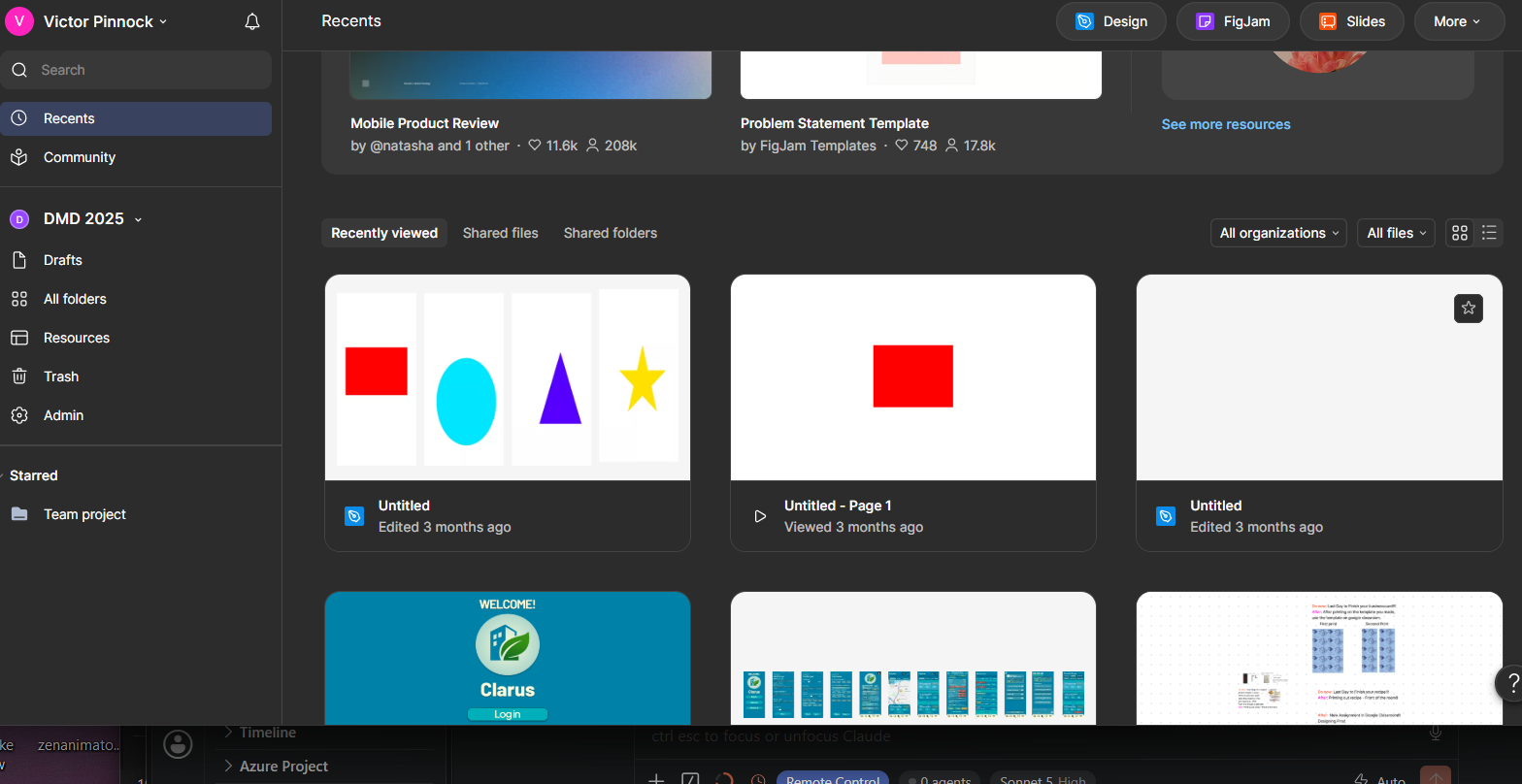
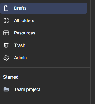
| Dashboard | The page you land on after logging in — recent files, drafts, and every project you have access to, all in one place. |
| Design / FigJam / Slides | Figma's three separate file types, all inside the same account — Design for real UI work, FigJam for whiteboard-style brainstorming, Slides for presentations. |
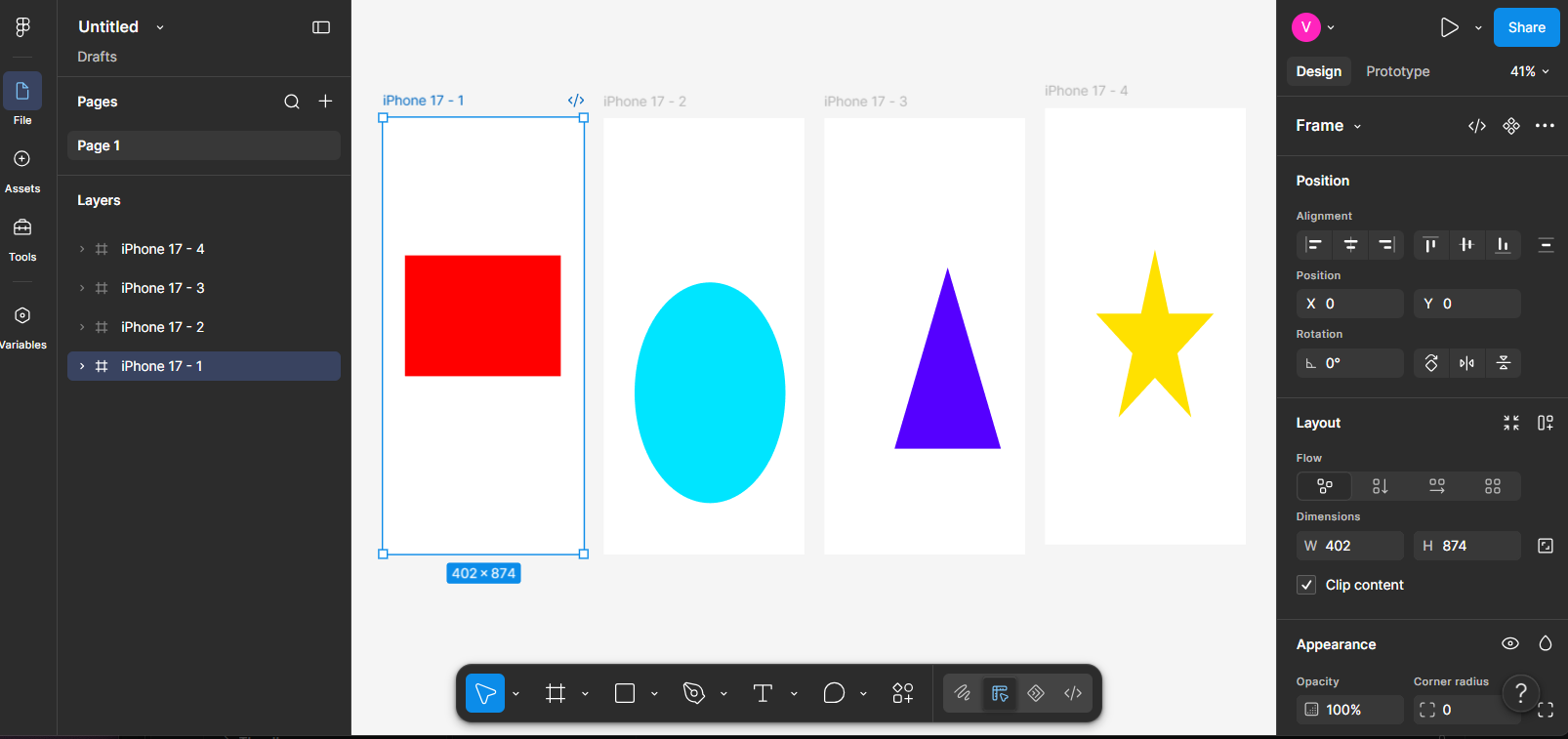
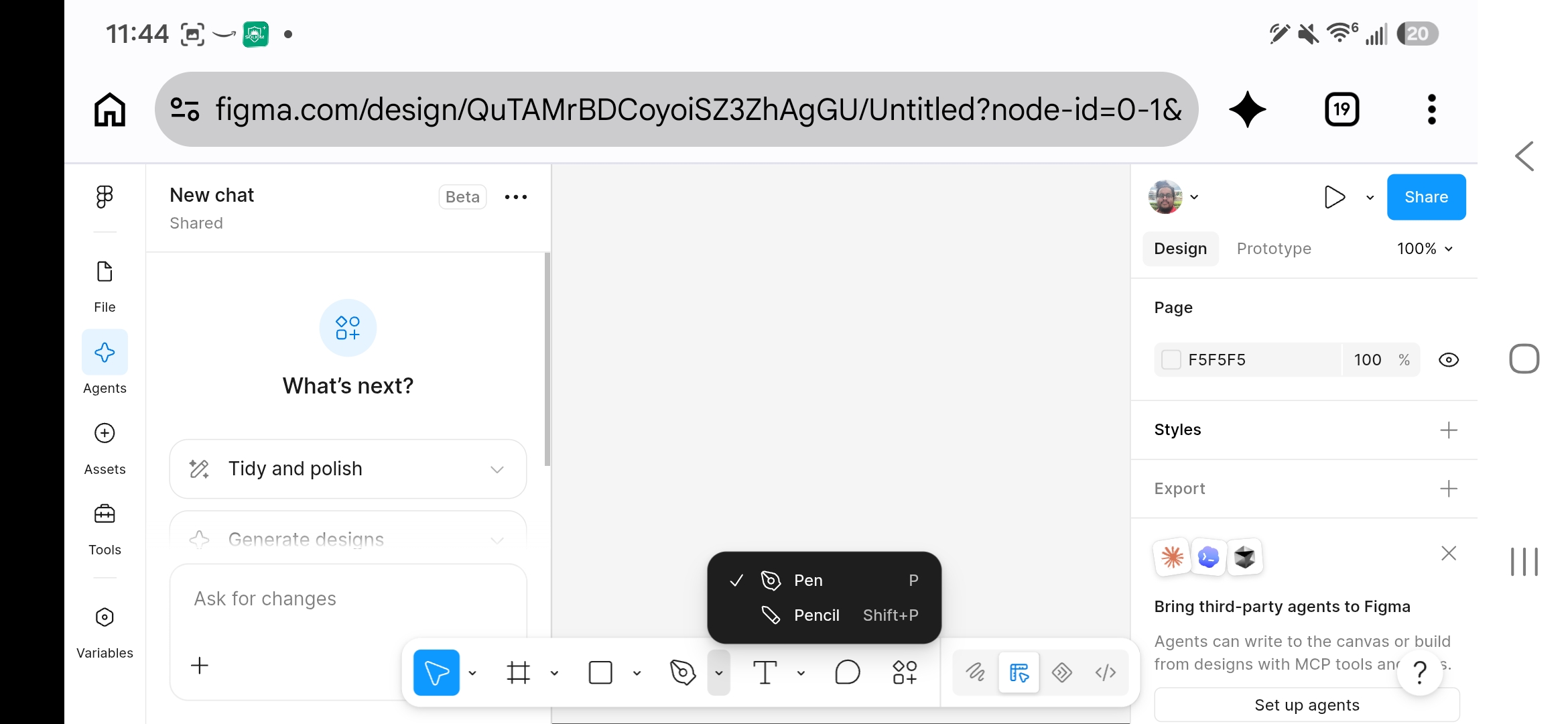
| Toolbar | Figma's core tool set — Move, Frame, Shape tools, Pen, and Text — the same tool-first workflow every other program in this series uses, just with different icons. |
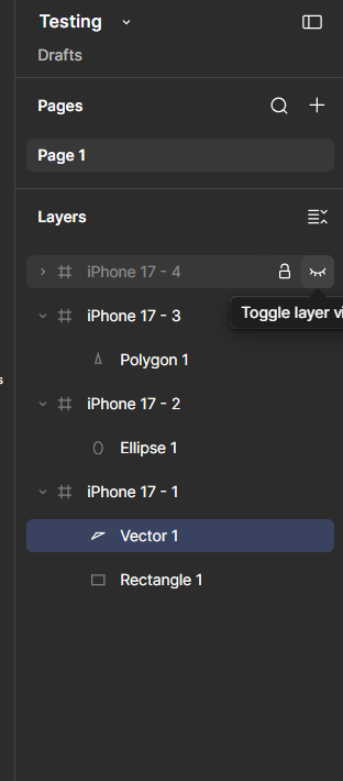
| Layers Panel | Lists every frame, shape, and element in a file, nested to match how objects are grouped — functionally the same panel as Photoshop's, Illustrator's, and InDesign's own Layers panels. |
| Zoom & View Options | Controls for navigating a large canvas — zoom level, rulers, pixel/layout grids, and (unique to Figma) live multiplayer cursors showing where collaborators are working. |
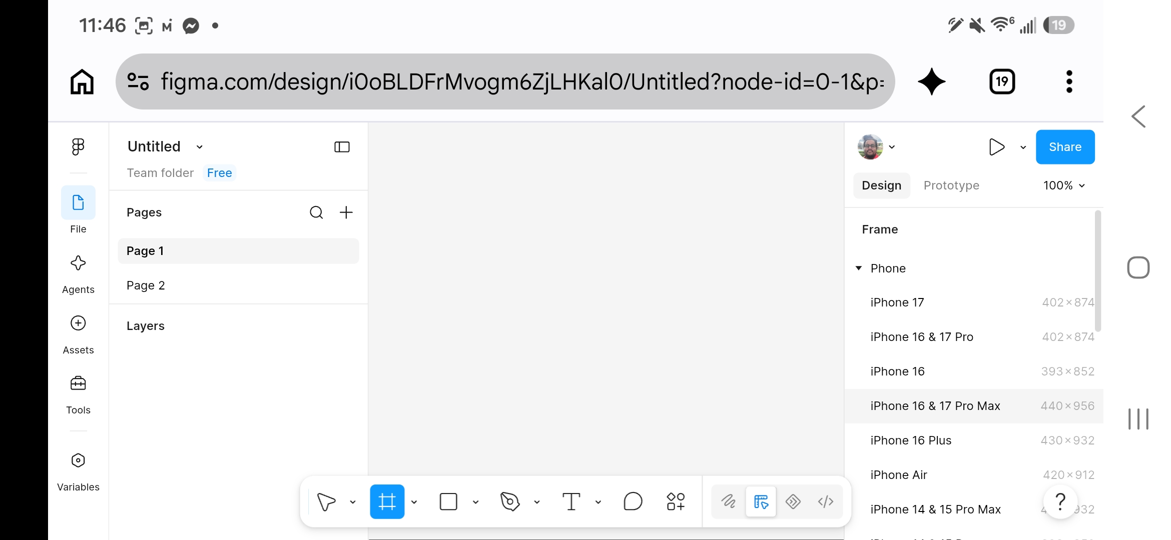
| Frame | Figma's version of an artboard/canvas — a defined area representing one screen. |
| Component | A reusable element (a button, an icon, a card) defined once and placed as linked instances — editing the main component updates every instance, the same underlying idea as Illustrator's symbols. |
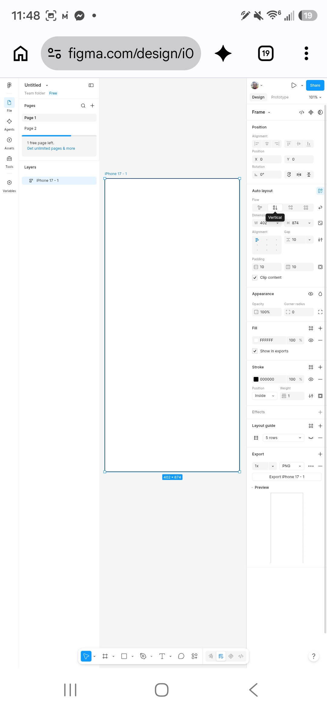
| Auto Layout | A Figma feature that automatically manages spacing and sizing within a frame as content changes, similar in spirit to a responsive layout. |
| Design File / Page | Figma organizes work into files, and files into pages, for keeping different projects or design phases separate. |
| Real-Time Collaboration | Multiple people editing the same Figma file simultaneously, seeing each other's cursors live — a defining feature of the tool. |
A free Figma account (education plans include more free pages, per the callout below) opens to a Dashboard, not directly into a file — the same starting point as any cloud-based tool, one level up from InDesign's or Illustrator's straight-into-a-document launch.
Figma's free tier limits how many pages and files a personal account can keep active at once — a real constraint worth knowing about before a class project runs into it mid-semester. Figma's Education plan removes most of those limits for verified students and teachers at no cost; signing up with a real school email address is what qualifies an account for it.
Every tool in this series so far has followed the same basic interface logic — a toolbar of core tools, a panel listing every layer, and controls for zooming and navigating the canvas. Figma is no exception, and getting comfortable with these three before anything else makes everything later in this chapter easier.
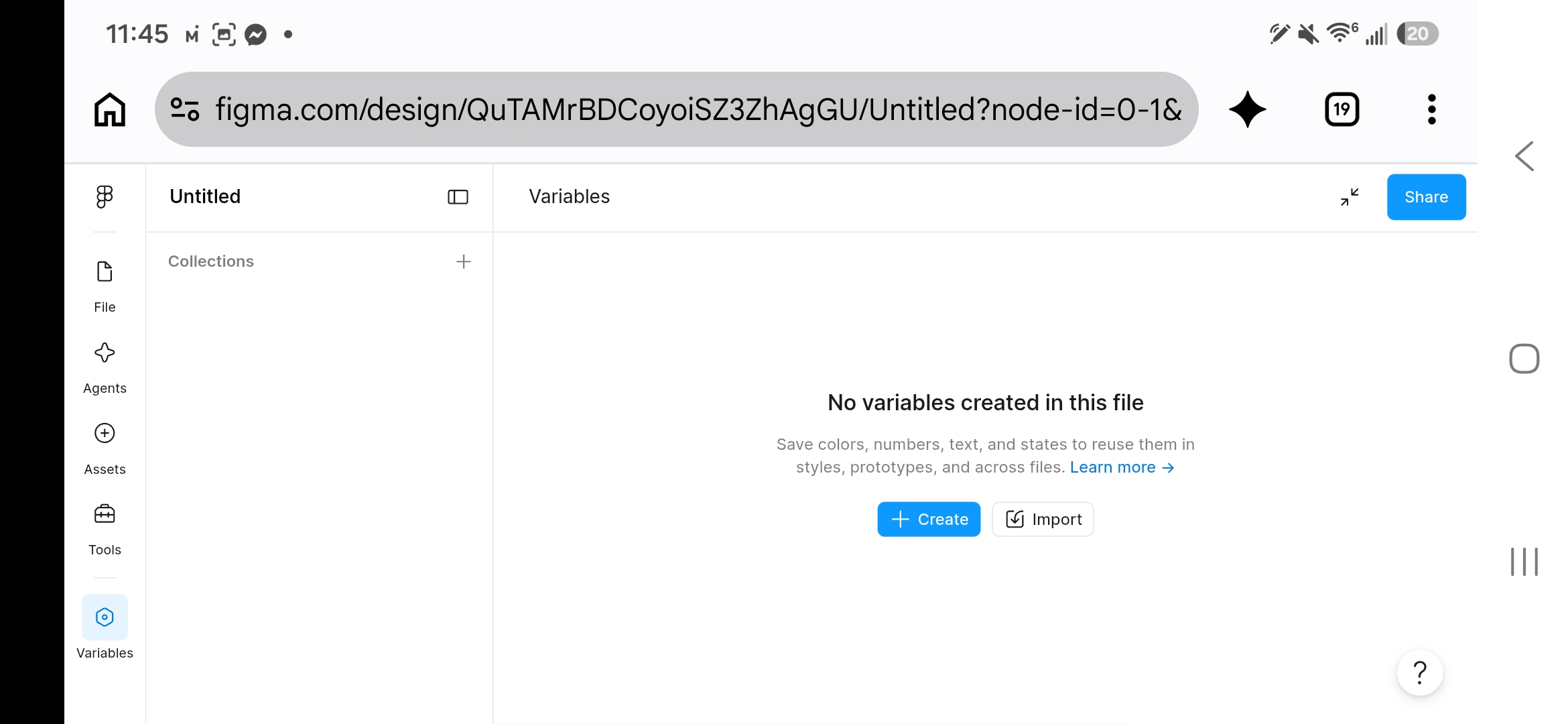
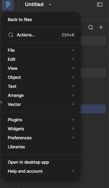
This is the third time this series has taught essentially the same concept under a different name: master pages (InDesign), symbols (Illustrator), and now components (Figma). All three exist because the same real production problem keeps showing up: a design element used many times needs to update everywhere at once when it changes, not require hunting down and fixing every individual instance by hand.
Create a free Figma account. Create a new file, add a phone-sized frame, and build a simple digital wireframe of your paper sketch from 4.1 using basic rectangles and text (mid-fidelity). Create one button as a component, place 3 instances of it on the frame, edit the master component's color, and confirm all 3 instances update.
A prototype connects static screens together so they can actually be clicked through, simulating the real experience before any code gets written.
| Prototype | A clickable, connected simulation of a product's flow, built from otherwise-static screens. |
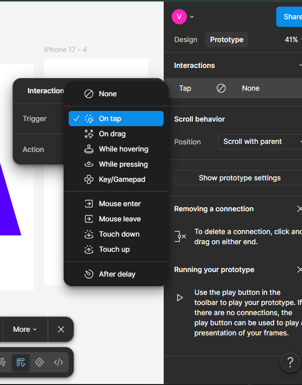
| Interaction / Trigger | What causes a transition between screens in a prototype — a tap, a click, a hover. |
| Transition | The visual effect (instant, dissolve, slide) used when moving between connected screens in a prototype. |
| Click-Through Test | Having a real user navigate a prototype to complete a task, revealing whether the intended flow is actually clear. |
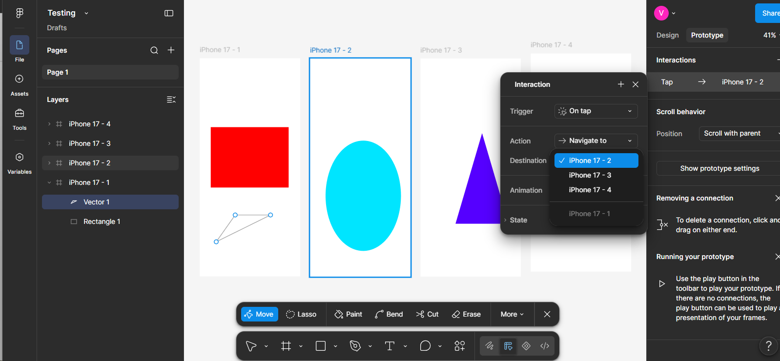
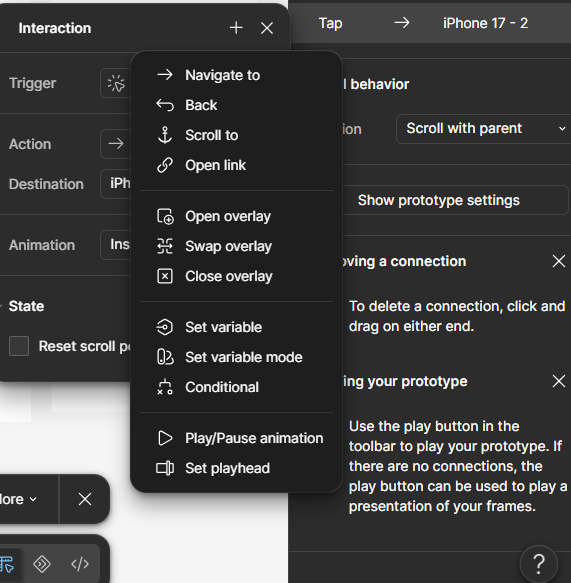
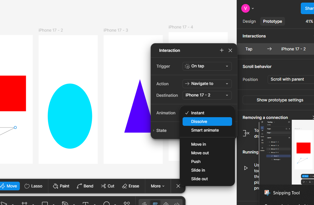
The whole point of building a prototype before real development starts is to test the idea cheaply. A prototype that reveals real confusion during a click-through test isn't a failure — it's the process working exactly as intended, catching a problem while it's still just a Figma file, not a shipped, expensive-to-change piece of software.
Build 2 more simple screens beyond your 4.2 wireframe (e.g., a settings screen and a class-detail screen). Use Figma's Prototype tab to connect all 3 screens with real click interactions matching your Chapter 3 user flow. Present it to a partner and have them click through it live, without explaining anything first — watch where they hesitate or click the wrong thing.
Looking ahead: Chapter 5 covers the visual design principles and accessibility standards that turn a working prototype into a genuinely well-designed interface.
Chapter Five
05
This is where a working prototype becomes a genuinely well-designed interface — not just functional, but clear, consistent, and usable by the widest possible range of real people.
Covered here: visual hierarchy and consistency (extending Elements & Principles of Design from earlier in this series into an interface context), design systems, accessibility basics, and responsive design.
The same Elements and Principles of Design from earlier in this series apply directly to interfaces — hierarchy and consistency show up constantly and specifically in UI work.
| Visual Hierarchy | Arranging an interface's elements so the most important ones are noticed first — through size, color, contrast, and position. |
| Affordance | A visual cue suggesting how an element can be used — a button that looks raised/clickable, a slider that looks draggable. |
| Feedback | A visible response confirming an action happened — a button changing color when tapped, a loading spinner, a success message. |
| Consistency | Using the same visual language (colors, spacing, icon style, terminology) throughout an entire product, so users don't have to relearn patterns on every screen. |
Text that's colored and underlined like a link, but isn't actually clickable, is a classic affordance failure — it visually promises an interaction it doesn't deliver, and users learn to distrust the interface's visual signals as a result. The reverse is just as real: a genuinely clickable element that gives no visual signal at all that it's interactive. Every interactive element should look interactive, and every static element shouldn't accidentally look like it is.
Screenshot or sketch a real app screen you use. Circle 3 elements with strong affordance (clearly signal how to use them) and 1 element (if you can find one) with weak or confusing affordance. Explain what specifically makes each work or not work.
A design system is how consistency gets enforced reliably across a large product built by many people over a long time — the UI equivalent of InDesign's paragraph styles or Illustrator's graphic styles, but for a whole product.
| Design System | A documented, reusable collection of components, colors, type styles, and usage rules shared across an entire product or company. |
| Component Library | The actual set of reusable UI components (buttons, form fields, cards) that make up a design system. |
| Style Guide | Documentation defining exactly how a brand's colors, type, and components should be used correctly. |
| Design Token | A named, reusable value (a specific color, spacing amount, or font size) that keeps a design system consistent when values need to change. |
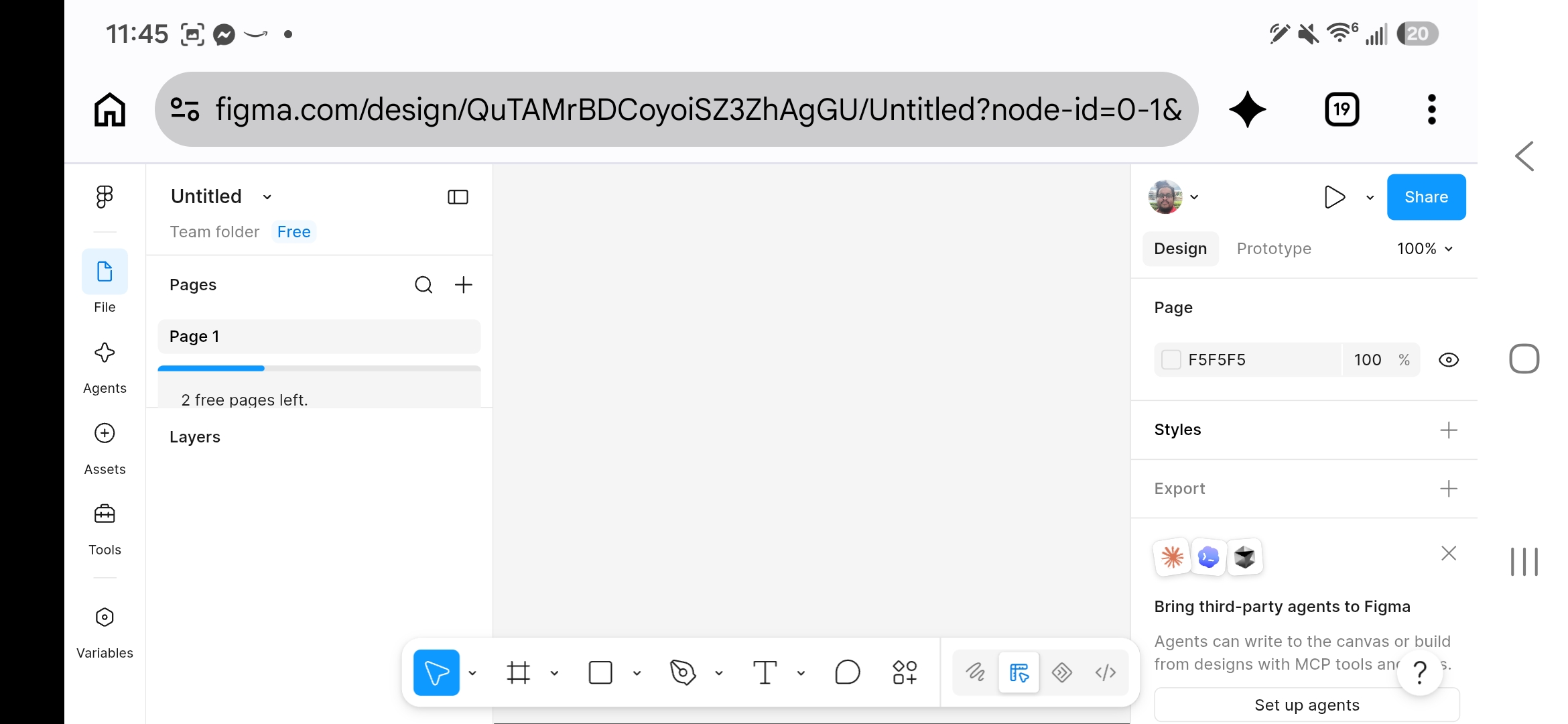
Without a shared design system, different designers on the same team routinely build slightly different-looking buttons, slightly different blues, slightly inconsistent spacing — small differences that add up to a product that feels disjointed even though every individual screen might look fine on its own. A real design system exists to make consistency the default, automatic outcome, not something each designer has to remember and enforce manually every time.
Build a small design system page in your Figma file: 3 color swatches (with hex codes labeled), 2 defined text styles (a heading and body text), and your button component from Chapter 4, all laid out together with labels — a miniature version of a real style guide.
Designing so that people with disabilities can actually use a product isn't an optional add-on — it's a core, real part of professional UI work, guided by a real published standard: the Web Content Accessibility Guidelines (WCAG).
| WCAG | Web Content Accessibility Guidelines — the internationally recognized standard for making digital content accessible. |
| Color Contrast Ratio | A measured value describing how distinguishable text is from its background — WCAG's commonly-cited AA standard requires at least 4.5:1 for normal text, 3:1 for large text. |
| Alt Text | A written description of an image, read aloud by screen readers for users who can't see the image itself. |
| Keyboard Navigation | The ability to use an entire interface without a mouse, using only Tab, Enter, and arrow keys — essential for many users with motor disabilities. |
| Screen Reader | Software that reads a screen's content aloud, used by many blind and low-vision users to navigate digital interfaces. |
Captions, originally built for deaf and hard-of-hearing users, are now used constantly by people watching video in a quiet public space with no headphones. High-contrast text, built for low-vision users, helps everyone read a screen in bright sunlight. Accessible design is very often just genuinely better design for a much wider range of real, temporary, and situational circumstances — not a narrow feature for a small group.
Check your Chapter 5.2 text colors against their backgrounds using a free online contrast checker (search "WCAG contrast checker"). If any combination fails the 4.5:1 AA standard, adjust it until it passes. Write alt text descriptions for any images/icons in your prototype, as if a screen reader needed to describe them aloud.
A single design needs to work correctly on a huge range of real screen sizes — a small phone, a large tablet, a widescreen monitor — and responsive design is the practice of making that happen deliberately, not by accident.
| Responsive Design | Designing an interface to adapt its layout appropriately across different screen sizes and devices. |
| Breakpoint | A defined screen-width threshold where a layout deliberately changes structure (e.g., a 3-column layout collapsing to 1 column on a phone-sized screen). |
| Mobile-First Design | Designing for the smallest, most constrained screen size first, then expanding the design for larger screens — forces early, disciplined prioritization of what actually matters most. |
| Fluid Layout | A layout that resizes smoothly and proportionally, rather than only at fixed breakpoints. |
Starting a design on the smallest, most limited screen forces hard, useful decisions early: with very little space, what's actually essential, and what can wait or move elsewhere? Designing for a huge desktop monitor first makes it easy to cram in extra content that never gets seriously questioned — then painfully hard to figure out what to cut once the same design needs to fit on a phone.
Duplicate your schedule-app screen from Chapter 4 twice: resize one frame to a small phone width and one to a tablet width. Redesign the layout for each size (not just shrinking the same layout) — identify what needs to change structurally, not just scale down, at the smaller size.
Looking ahead: Chapter 6 puts a finished design in front of real users to see if it actually works.
Chapter Six
06
A prototype's real test isn't whether the designer thinks it works — it's whether a real person, with no explanation, can actually use it.
This chapter covers real usability testing methods, and explicitly connects them to critique skills already built earlier in this curriculum.
Usability testing means watching real people try to use a design and complete real tasks — not asking them if they like it, which is a very different and much less useful question.
| Usability Testing | Observing real users attempting real tasks with a design, to find out what actually works and what doesn't. |
| Task | A specific, concrete action a test participant is asked to attempt (not "explore the app" — "find and book an appointment for next Tuesday"). |
| Think-Aloud Protocol | Asking a test participant to say what they're thinking out loud while using the design, revealing confusion in real time. |
| A/B Testing | Showing two different versions of a design to different user groups and measuring which performs better on a specific goal. |
A participant might say "this was easy!" while visibly struggling, clicking the wrong button twice, and finally stumbling onto the right path by accident — people are often more forgiving in their words than their actual behavior reveals. Real usability testing weighs what a person does at least as heavily as what they say, and the Think-Aloud Protocol exists specifically to narrow that gap by surfacing hesitation and confusion as it happens.
Give a partner one specific task using your Chapter 4 prototype (e.g., "find tomorrow's third-period class"). Ask them to think aloud the whole time. Take notes on where they hesitate, click the wrong thing, or say something confused — without helping or explaining anything until the task is fully over.
This is a direct application of the critique skills already built into this curriculum — the “I notice / I wonder” protocol from your Grade 9-12 studio and client-project work applies exactly here, just with a real target user instead of a classmate.
| Iteration | Revising a design based on real feedback or test results, then testing again — the same feedback-cycle idea from earlier critique work, applied to a prototype instead of a finished piece. |
| Severity | How serious a usability problem is — a confusing label is lower severity than a button that fails to complete a critical task at all. |
| Actionable Feedback | Feedback specific enough to actually act on — "the submit button is hard to find because it's the same gray as the background" rather than just "it feels off." |
This whole curriculum has built the same underlying skill from 9th grade forward: give and receive specific, vocabulary-rich feedback, and treat a first draft as expected to change, not a personal failure when it does. Usability testing is that exact same discipline, just aimed at real target users instead of classmates — and just like a real client relationship (the connection made explicitly back in that earlier critique work), a design failing its first usability test isn't a disaster. It's the process working correctly.
Using your notes from 6.1, list every problem you observed, rank each by severity (high/medium/low), and pick the top 2 to actually fix. Revise your prototype to address them, then have your partner attempt the same task again and compare how it went the second time.
Looking ahead: Chapter 7 closes the book with a look at real UX/UI careers — the roles, the skills each one needs, and where the field is headed.
Chapter Seven
07
UX/UI is one field with several genuinely different jobs inside it — understanding the real roles helps in deciding what to actually pursue, and what skills from this book matter most for each one.
This chapter is scoped to UX/UI careers specifically. A fuller cross-curriculum look at design careers broadly — real pay data, employee vs. contractor vs. business-owner comparisons — is planned as separate, dedicated material once properly researched.
| Role | Focus |
|---|---|
| UX Researcher | Runs interviews, surveys, and usability tests; turns raw findings into personas, journey maps, and actionable insight for the rest of the team. |
| UX Designer | Owns structure and flow — sitemaps, user flows, wireframes, information architecture. |
| UI Designer | Owns the visual and interactive surface — color, type, components, the design system. |
| Product Designer | A combined role covering both UX and UI responsibility, common at smaller companies or startups. |
| Interaction Designer | Focuses specifically on how users interact with a product moment-to-moment — animations, transitions, micro-interactions. |
A small company or startup very often needs one person to be a UX Researcher, UX Designer, UI Designer, and Interaction Designer all at once — exactly why "Product Designer" exists as a catch-all title. Larger companies with bigger design teams are more likely to have these as genuinely separate, specialized roles.
| UX Researcher needs | Interview skills, comfort with both qualitative and quantitative methods, and clear written/visual communication to summarize findings for a team. |
| UX Designer needs | Information architecture, wireframing, systems thinking, and the ability to defend structural decisions with real research. |
| UI Designer needs | Strong visual design fundamentals (Elements & Principles, typography, color theory), design-system discipline, and tool fluency (Figma). |
| Shared across all roles | Communication, giving/receiving critique well, collaboration with developers, and genuine curiosity about how real people actually behave. |
Look back across this whole book, chapter by chapter. For each of the 5 roles above, list 2-3 specific chapters/skills from this book that role would lean on most. Then honestly rank which one role sounds most interesting to you personally, and write 2-3 sentences on why.
UX/UI has grown into a genuinely established field over the past 10-15 years, as more and more of daily life moved onto apps and websites that need real design thinking behind them. That growth hasn't been perfectly steady — the tech industry broadly went through real, well-documented layoffs in 2022-2023, and design roles were not immune to that. The honest takeaway isn't "this field is guaranteed" or "this field is doomed" — it's that UX/UI, like most tech-adjacent fields, has real cycles, and a portfolio of genuine, well-documented project work (exactly what this book's exercises are building toward) matters more in a competitive job market than it does in an easy one.
A responsible discussion of real salary ranges, freelance vs. full-time work, and how income actually works across employee/contractor/business-owner structures needs real, current, cited data — not a rough guess dropped into this chapter. That fuller treatment, covering UX/UI alongside every other design career this curriculum touches, is planned as its own dedicated, properly-researched material rather than rushed here.
That's the whole book. Seven chapters, following the real UX/UI process start to finish: research, ideation, structure, wireframing, visual design, testing, and where the field actually leads. Between this book and Paper First, the full arc from a first pencil sketch to a tested, real-tool prototype is now covered.
Back Matter
This book isn't aligned to a single software exam, so its accuracy rests on real, named industry standards and documentation instead. This section collects all of them in one place.
| Web Content Accessibility Guidelines (WCAG) 2.21 | The official W3C accessibility standard behind this book's accessibility chapter — contrast ratios, text sizing, and the other concrete, testable rules covered there come directly from this real, current standard, not an approximation. |
| Figma Help Center2 | Adobe's own official documentation site fills this role for the Adobe books in this series; Figma's official Help Center fills it here — the authoritative reference for verifying interface facts, panel names, and terminology throughout this book's hands-on chapters. |
| Nielsen Norman Group3 | One of the most-cited, longest-running UX research organizations in the industry, used as a topic map confirming what real UX research and usability testing practice covers — never copied as text into this book. |
Every figure in this book is a real, unedited screenshot captured directly from Figma by this teacher, specifically to illustrate this edition — Frame creation with real device presets, the Auto Layout panel, the Pages panel, a real interactive-prototyping workflow (a drawn connection, the Action list, and the Transition options), and the Variables panel behind Figma's design tokens. No screenshot in this book was sourced from any outside party, a tutorial, or Figma's own marketing material.
▸ See the Preface at the front of this book for this edition's full license and terms of free use.