Digital Media Design · Bronx International High School
The Vector Path
An Illustrator & Vector Design Study Book
6 chapters · 5 exam domains · every term testable on the real exam
Digital Media Design · Bronx International High School
An Illustrator & Vector Design Study Book
“The Vector Path” is Book Five in this Digital Media Design series, written by a teacher at Bronx International High School for his own students and provided to them entirely free of charge. Where “The Digital Path” (Book Three) covers Photoshop and “The Layout Path” (Book Four) covers InDesign, this book covers Adobe Illustrator — the industry-standard tool for building anything that needs to scale to any size without losing quality: logos, icons, illustrations, and vector artwork. It's aligned chapter-for-chapter to the real, current Adobe Certified Professional exam for Illustrator.
You are free to copy, share, print, and adapt this book, for any educational purpose, at no cost to anyone — on the following conditions: attribution required (credit “The Vector Path” whenever this material or an adapted version is shared or reused); non-commercial only (never sold, licensed, or placed behind a paywall, in whole or in part); always free (anyone receiving a copy, or a copy adapted from it, must be able to receive it at no cost). Same license as every other book in this series.
This book's chapter structure and the exact domain breakdown inside each chapter come directly from Adobe's own published exam objectives for “Graphic Design & Illustration Using Adobe Illustrator” (certifiedprofessional.adobe.com/illustrator, verified September 2026). No text in this book is copied from that page or from any Adobe help article — the domain names are Adobe's real structure, but every explanation, example, and exercise is original writing for this class. Illustrator's real Firefly AI features (Chapter 5.2) were verified directly against Adobe's own current help documentation and product pages, the same discipline used for the AI-features section of The Layout Path. Every screenshot in this book was captured directly from a real, current Illustrator install — full citations are collected in the Sources & References section at the back of the book.
Every chapter below is written to real teaching depth — key terms, worked examples, paper and hands-on exercises, review questions — and illustrated throughout with real screenshots captured from a current Illustrator install, not placeholder diagrams. See the Sources & References section at the back of the book for full citations.
Chapter One
01
No software needed for this chapter — and it's the first domain of the exam for a reason: a perfectly-built vector logo can still fail if it wasn't built for the right audience, uses an illustration style nobody had permission to copy, or falls apart under the design principles a real critique would apply to it.
Illustrator's whole reason for existing is building artwork that needs to work at any size, in any context — a logo on a business card and the same logo on a billboard. That flexibility starts with the same foundation every design tool does: understanding purpose, audience, legal use, vocabulary, and design principles, before a single anchor point gets placed.
Vector work often has an even longer lifespan and wider reach than a single flat image — a logo built today might represent a business for a decade, appear on everything from a tiny app icon to a storefront sign. That makes purpose and audience thinking especially high-stakes here.
| Brand Identity | The consistent visual system (logo, colors, type, icon style) a business or organization uses to represent itself everywhere it appears. |
| Scalability | How well a piece of artwork holds up in quality across a wide range of sizes — the central reason vector work exists at all. |
| Use Case | A specific real-world context a piece of artwork needs to work in (an app icon, embroidery, a vehicle wrap) — different use cases place very different demands on the same logo. |
| Deliverable | The actual finished file(s) a client receives — for vector work, often several file formats and color variations, not just one flat image. |
A real logo commission rarely ends with one file. A client typically needs: a full-color version, a single-color (often black) version for occasions where color printing isn't possible, and sometimes a simplified version for very small use cases (an app icon or a favicon) where fine detail would just turn into visual noise at that size. Planning for this range of use cases from the start — not just designing one pretty version and hoping it holds up everywhere — is part of professional logo design, not an afterthought.
Find a real logo you recognize instantly (a sports team, a brand, your school). Sketch it from memory at three different sizes: as big as your whole page, the size of a coin, and the size of a grain of rice (as best you can). Write 1-2 sentences on which details survived at every size and which ones would need to be simplified or dropped for the smallest version to still be recognizable.
Everything from this series' earlier books about copyright still applies: no using someone else's protected artwork, photo, or font in client work without permission. Illustration and logo work adds one specific risk worth naming directly — trademark, a separate legal protection from copyright.
| Trademark | Legal protection for a brand's name, logo, or symbol specifically as an identifier of that brand — separate from copyright, which protects the artistic work itself. |
| Original Work | Artwork genuinely created by the artist, not traced, copied, or closely derived from someone else's protected work. |
| Reference vs. Copying | Using an existing image to inform proportions, pose, or lighting (legitimate and common) versus directly tracing or closely reproducing someone else's original artwork (a real copyright problem). |
| Clip Art License | Permission terms for pre-made vector graphics, ranging from fully free-to-use to requiring attribution or a paid commercial license. |
Beyond straightforward copying, a new logo that looks too close to an existing, recognizable brand's logo — even without literally copying a single file — can create a trademark problem: real confusion about whether the two are related. This is exactly why "make me a logo kind of like [famous brand]'s" is a professional red flag, not a shortcut — a designer's job is building something genuinely original that still communicates the right feeling, not adapting someone else's protected identity.
Pick a well-known logo. Without looking at it, sketch 3 completely original logo concepts for a fictional business in the exact same industry, that feel similarly professional/trustworthy/fun (whatever that brand communicates) without copying or closely resembling the real logo's actual shapes. Write one sentence on how you achieved a similar feeling through entirely different specific choices.
Illustrator's entire toolset is built around one core concept from this series' Book Three: the difference between raster and vector images. Every term in this section builds directly on that foundation.
| Path | The mathematical line (straight or curved) that defines a vector shape's outline. |
| Anchor Point | A defined point along a path where its direction can change — the fundamental building block of every vector shape. |
| Bézier Curve | A curved path segment controlled by anchor points and their direction handles, named for the mathematician who formalized the underlying math. |
| Fill | The color or pattern applied to the enclosed area inside a path. |
| Stroke | The color, weight, and style applied along a path's outline itself, separate from its fill. |
| Image Trace | Illustrator's built-in tool for automatically converting a placed raster image into vector paths. |
Recall from Book Three: a raster image is a fixed grid of pixels, and a vector image is built from mathematical paths that redraw cleanly at any size. Illustrator is built entirely around creating and editing those paths directly — every tool in this book, from the Pen tool (Chapter 4) to Live Paint, ultimately exists to place, connect, and adjust anchor points and the paths between them.
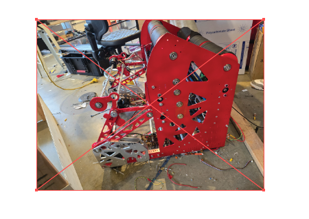
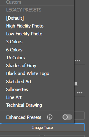
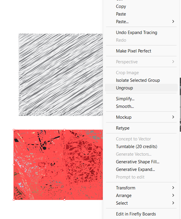
A placed photo is still a raster image — a grid of pixels — until Image Trace converts it. Selecting the placed image and choosing a tracing preset (Object > Image Trace, or the Quick Actions panel) analyzes the pixels and builds vector paths from them automatically.
On a blank page, mark 5 dots (anchor points) in a rough curve pattern. Connect them with a single smooth, flowing line by hand — the physical version of what a Bézier path does mathematically. Label 2 of the anchor points, and next to each, sketch small "handle" lines showing which direction the curve is being pulled through that point.
Place a photo with clear, simple edges (a logo on a product, a labeled diagram). Run Image Trace with the Black and White Logo preset, then try the same image again with High Fidelity Photo. Expand both and compare: how many paths did each one generate, and which is actually usable as a starting point versus which needs heavy cleanup?
This domain is specifically about critique — looking at a finished piece of vector artwork and judging whether it actually applies real design principles well, using the same shared vocabulary from earlier in this series (hierarchy, contrast, balance, alignment, proximity, repetition, white space, unity).
The same Elements and Principles apply here, but a few show up in especially logo-specific ways worth naming directly: simplicity (a strong logo usually reads clearly even at very small sizes — the more detail it needs to work, the less scalable it actually is), versatility (does it still work in one color, reversed on a dark background, at tiny scale?), and memorability (can someone sketch its basic shape from memory after seeing it a few times?).
Find 3 real logos. For each, evaluate it against simplicity, versatility, and memorability using "I notice / I wonder" language (from earlier in this curriculum): what specifically makes it work, and one thing you'd genuinely question or critique about it. Rank all 3 from strongest to weakest and justify your ranking in a short paragraph.
Looking ahead: Chapter 2 opens Illustrator for the first time — setting up a document correctly, understanding artboards (Illustrator's unique multi-canvas system), and managing project assets from start to export.
Chapter Two
02
Illustrator's document setup is built around a genuinely unique idea among Adobe's apps: a single file can hold multiple separate canvases at once. Getting comfortable with that from the start changes how you think about every project that follows.
This chapter covers creating and configuring a new document for its intended output, using artboards, keeping a project's assets organized, and saving/exporting finished work correctly.
Like InDesign, Illustrator's New Document dialog (File > New) asks about intended output up front — but because Illustrator artwork is vector, some settings (like resolution) matter differently here than they do in a raster tool.
| Profile | A starting-point document preset (Print, Web, Mobile, Film & Video) that sets sensible defaults for units, color mode, and raster effects resolution. |
| Raster Effects Resolution | The resolution used only for any raster-based effects (like a drop shadow or blur) applied within an otherwise vector document — matters for print output even though the artwork itself is vector. |
| Color Mode | RGB for anything screen-bound, CMYK for anything print-bound — same core rule as the rest of this series, set at document creation. |
| Bleed | Same concept as in InDesign: extra edge area for any print-bound artwork meant to run to the trimmed edge. |
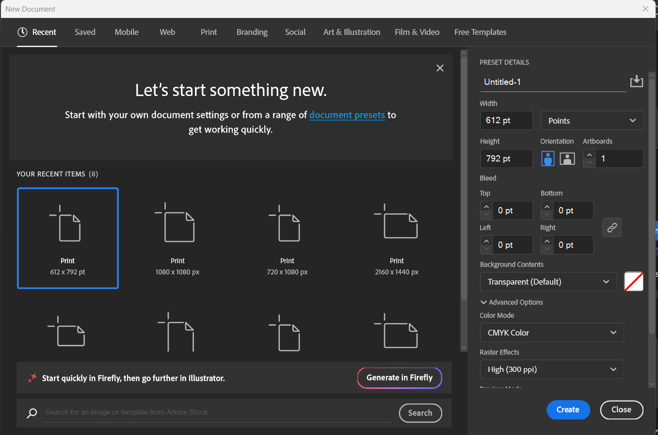
It's tempting to assume "vector work has no resolution to worry about" — true for the actual paths and shapes, but not entirely true for the document as a whole. Any raster-based effect (a soft drop shadow, a Photoshop effect applied inside Illustrator) still rasterizes at a set resolution, and that setting (Effect > Document Raster Effects Settings) needs to match the final output — low for web, high (usually 300 PPI) for print — or those specific effects can come out blurry or overly heavy in the final file.
Create a new Print profile document (Letter size, CMYK, 0.125in bleed) and a new Web profile document (1920x1080px, RGB). Draw the same simple vector shape in both. Apply a drop shadow effect to each, and open Effect > Document Raster Effects Settings in both documents to compare their default resolution settings.
An artboard is Illustrator's version of a canvas — and unlike Photoshop or a single InDesign page, one Illustrator file can contain many artboards side by side, each an independent, exportable canvas.
| Artboard | An individual, defined canvas area within an Illustrator document — a single file can contain many. |
| Artboards Panel | Lists every artboard in a document, used to navigate, rename, and reorder them. |
| Artboard Tool | Used to create, resize, duplicate, and delete artboards directly on the canvas. |
| Pasteboard | The gray working area surrounding all artboards, shared across the whole document. |
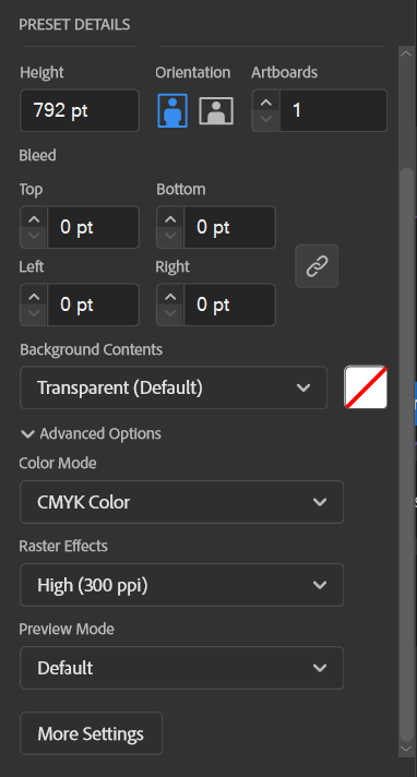
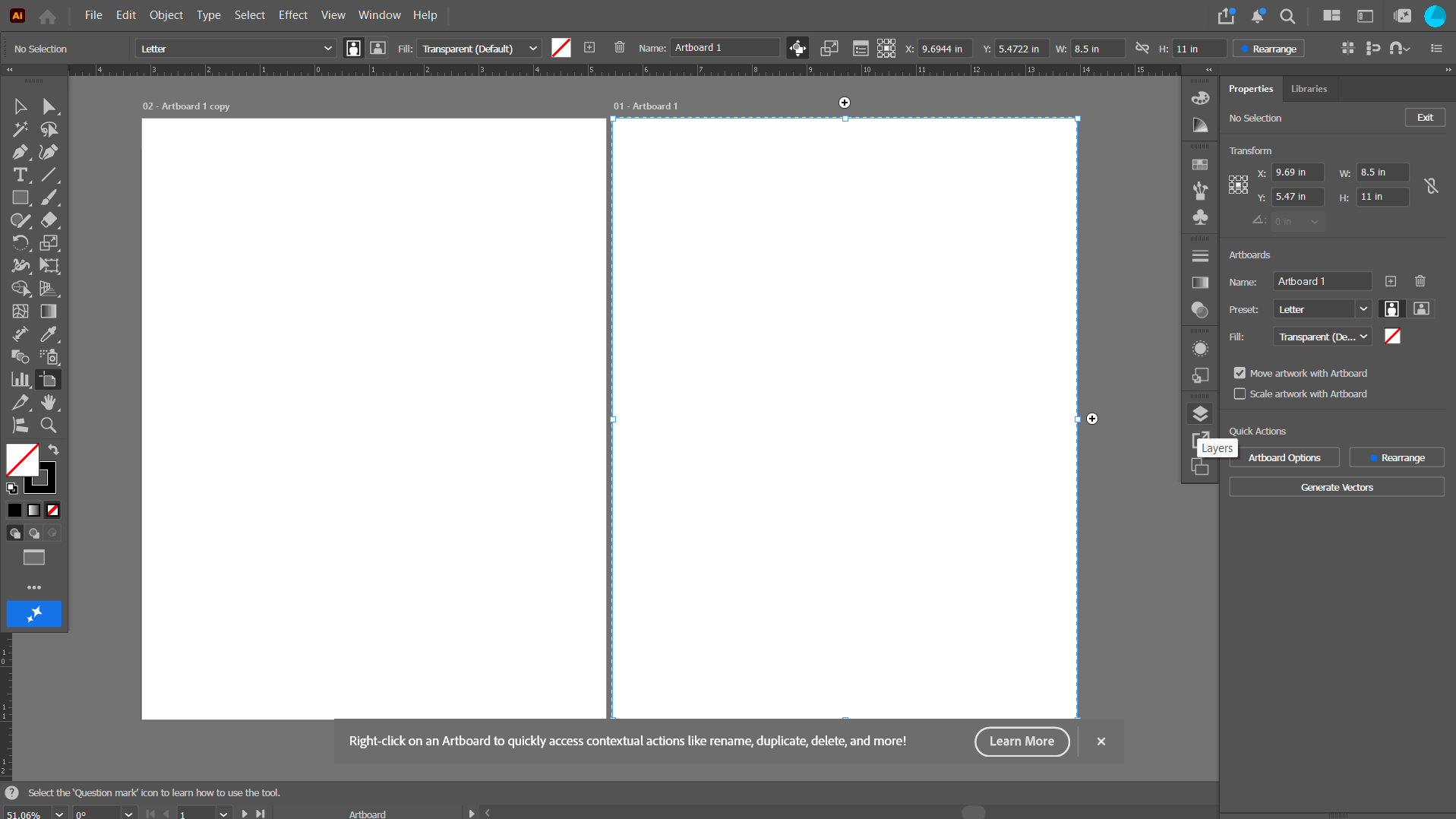
Imagine designing a full brand identity: a logo, a business card, a social media icon, and a letterhead. All four are related and often reuse the same elements (the logo itself, a color palette) — keeping them as four separate artboards in one Illustrator file means they can be designed, adjusted, and exported together, staying visually consistent, instead of managing four completely separate files that could quietly drift out of sync with each other.
In one document, create 4 artboards of different sizes: a square (social icon), a business-card size, a Letter-size page (letterhead), and a wide banner. Place or draw a simple logo shape on the first artboard, copy it to the other three, and resize it appropriately for each. Use the Artboards panel to rename each one clearly (not "Artboard 1," "Artboard 2").
Like InDesign, Illustrator documents often depend on outside files — placed images, fonts, linked artwork — that need active management to keep a project self-contained and up to date.
| Links Panel | Shows every placed image in a document, whether it's linked or embedded, and its current status (up to date, missing, modified). |
| Embed | Storing a full copy of a placed image directly inside the Illustrator file, disconnecting it from its original outside source. |
| Asset Export Panel | Collects objects, artboards, or groups a designer flags for export, letting several be exported together at once in one or more formats/sizes. |
| Creative Cloud Libraries | A shared, cloud-synced collection of colors, graphics, and character styles usable across Illustrator, Photoshop, and InDesign alike. |
Unlike InDesign's link-by-default convention, Illustrator artwork is very often embedded rather than linked, especially for smaller, self-contained pieces like a single logo file meant to be handed off as one clean deliverable. The tradeoff is the same one from Book Four, just flipped: embedding makes the file self-sufficient (nothing goes missing if sent to someone else) at the cost of a larger file size and losing the "auto-update if the original changes" convenience of linking.
Place an image two ways in the same document: once as a normal (linked) placement, and once using the Links panel menu to Embed it. Open the Links panel and identify which icon distinguishes a linked asset from an embedded one.
Illustrator's own native format keeps everything fully editable; export formats trade that editability for compatibility with wherever the artwork is actually headed.
| .ai | Illustrator's native, fully-editable vector file format. |
| .eps | An older, widely-compatible vector format, still requested by some print vendors and older software. |
| .svg | A vector format built for the web — scalable, small file size, and readable directly by web browsers. |
| Export for Screens | A dedicated export workflow for generating multiple sizes/resolutions/formats of the same artwork at once, built for app icons and web assets. |
| Rasterize | Converting vector artwork into a fixed-pixel raster image — a one-way conversion that loses the ability to scale losslessly afterward. |
Handing a client an editable source file: .ai. Sending final vector artwork to an older program or some commercial printers: .eps. Using the artwork on a website where it needs to scale to any screen: .svg. Needing a flat, universally-viewable image (a raster export) for something like a social media post: .png or .jpg, understanding that this is a one-way conversion away from the editable vector original.
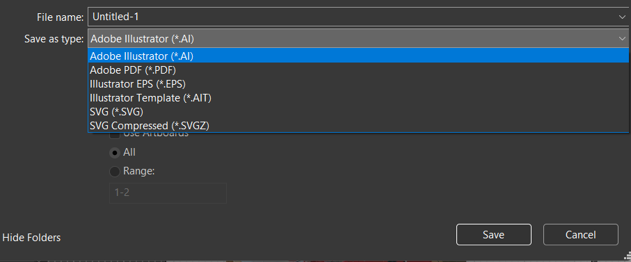
Take your 4-artboard document from 2.2. Use File > Export > Export for Screens to export all 4 artboards at once as PNGs. Then export just the logo artboard individually as an .svg and open that .svg file directly in a web browser to confirm it displays correctly.
Looking ahead: Chapter 3 covers the workspace itself and Illustrator's rich set of workflow tools — color, brushes, symbols, patterns, and layers.
Chapter Three
03
This is the largest domain on the real exam, and for good reason — it covers most of what makes Illustrator's day-to-day workflow genuinely fast once it's second nature: the workspace itself, alignment aids, color management, and a set of reusable-content tools (brushes, symbols, patterns) that have no real Photoshop or InDesign equivalent.
Covered here: navigating and customizing the workspace, design aids, color/swatches/gradients, brushes/symbols/styles/patterns, and layers.
Illustrator's workspace follows the same general Adobe layout as Photoshop and InDesign — Tools panel, Control panel, docked panels — with its own specific selection-tool distinction that matters constantly.
| Selection Tool | Selects and moves an entire object or group as one unit. |
| Direct Selection Tool | Selects and adjusts individual anchor points or path segments within an object. |
| Control Panel | The context-sensitive options bar that changes based on the current tool/selection. |
| Properties Panel | A consolidated view of the most relevant settings for whatever's currently selected. |
| Workspace Switcher | Quickly swaps between saved panel arrangements (Essentials, Typography, Painting, and custom saved layouts). |

Recall Book Four's frame-versus-content distinction between InDesign's two selection tools. Illustrator's version of that same idea: the black-arrow Selection tool grabs a whole object; the white-arrow Direct Selection tool reaches inside it to grab one specific anchor point or path segment, letting a designer reshape part of an object without touching the rest of it. This distinction underlies almost everything in Chapter 4.

Draw a simple 4-point polygon. Using the Selection tool, move the whole shape. Switch to the Direct Selection tool, click one single anchor point, and drag just that point to reshape the polygon without moving the others. Write one sentence describing the difference in what got selected each time.
The same non-printing structural helpers from InDesign exist in Illustrator, plus a few vector-specific additions built for precise object placement and alignment.
| Smart Guides | Temporary alignment guides that appear automatically while drawing or moving objects near each other. |
| Ruler Guide | A non-printing guide line dragged from the ruler and placed anywhere on the artboard. |
| Grid | An evenly-spaced non-printing overlay across the artboard, used for precise, consistent object placement. |
| Outline View | Displays every object as just its bare paths, with no fill or stroke — useful for seeing a complex illustration's underlying structure and selecting overlapping objects precisely. |
| Isolation Mode | Temporarily edits one group or object in isolation from the rest of the artwork, dimming everything else so accidental edits elsewhere are impossible. |
In a complex illustration with many overlapping filled shapes, it can become genuinely hard to click exactly the object you want — a shape hiding entirely behind another, identically-colored one, for example. Switching to Outline View (View > Outline) strips away every fill and stroke, showing raw paths only, making the underlying structure and stacking order far easier to see and select correctly.
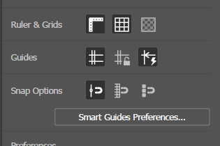
Draw 5-6 overlapping shapes with different fills. Switch to Outline View and notice how the same artwork reads completely differently. Double-click into one shape to enter Isolation Mode, make an edit, then exit and confirm the rest of the artwork was untouched.
Same core color-management ideas from Book Four's InDesign chapter apply here: swatches for consistency, CMYK for print, RGB for screen, spot colors for exact brand matching.
| Swatch | A saved, named, reusable color. |
| Swatch Group | A saved, organized set of related swatches — a full brand palette, for example — kept together for easy reuse. |
| Global Color | A swatch that, when edited, automatically updates every object using it throughout the document. |
| Recolor Artwork | A tool for testing and applying entirely new color schemes to existing artwork at once, without manually reselecting and recoloring each object. |
| Gradient | A smooth color transition, built and edited in the Gradient panel — can be applied to a fill, a stroke, or both. |
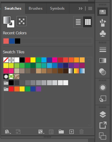
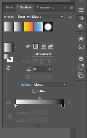
A global color swatch behaves like a live link rather than a one-time paint job: every object using that swatch updates automatically the moment the swatch itself is edited. For a brand logo built from a client's exact color, this means a single later change (the client wants their blue shifted slightly) updates every instance of that color throughout the file in one edit, rather than requiring the designer to hunt down and manually recolor every individual shape.
Create a global color swatch and apply it to 4 different shapes. Edit the swatch's color and confirm all 4 update at once. Apply a linear gradient (using two of your saved swatches as its stops) to a fifth shape's fill.
This section covers Illustrator's most distinctive reusable-content tools — features that don't have a real equivalent in Photoshop or InDesign, built specifically around vector artwork's ability to be reused, repeated, and applied along a path without ever losing quality.
| Brush | A defined stroke style (Calligraphic, Scatter, Art, Pattern, or Bristle) applied along any path, from simple line-weight variation to complex repeated artwork. |
| Symbol | A reusable piece of artwork stored in the Symbols panel — every placed instance links back to the master symbol, so editing the symbol updates every instance at once. |
| Graphic Style | A saved combination of appearance attributes (fill, stroke, effects) that can be applied to any object in one click, the object-level equivalent of a paragraph style. |
| Pattern | A small piece of artwork defined once and tiled automatically, seamlessly, to fill any shape's fill or stroke. |
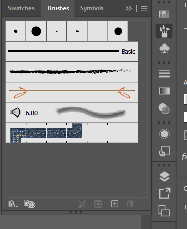
Copying and pasting a shape 50 times creates 50 completely independent objects — editing one does nothing to the others. Turning that same shape into a symbol and placing 50 instances of it instead means every instance stays linked to one master definition: edit the master symbol once, and all 50 placed instances update simultaneously. This matters constantly for icon sets, repeated decorative elements, and any illustration built from many copies of the same base element.
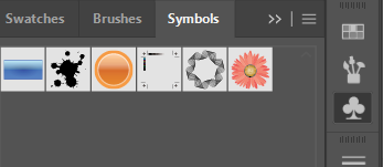
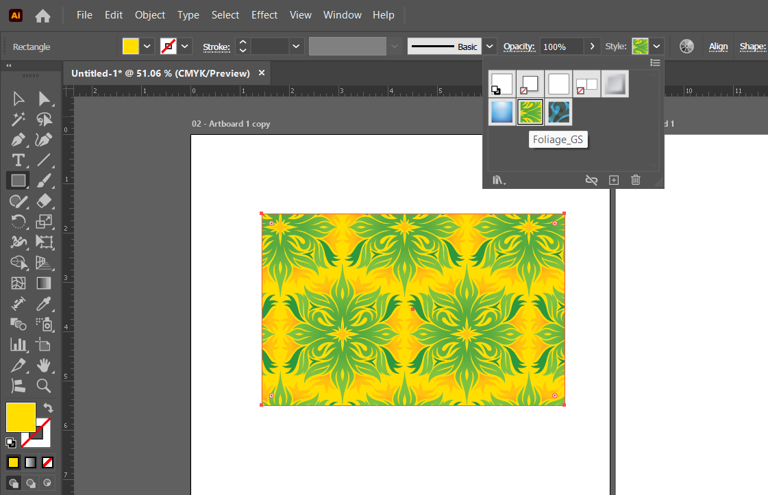
A pattern starts as ordinary artwork — a handful of small shapes, spaced out roughly the way they should repeat. Selecting it and choosing Object > Pattern > Make turns it into a live, editable pattern tile.
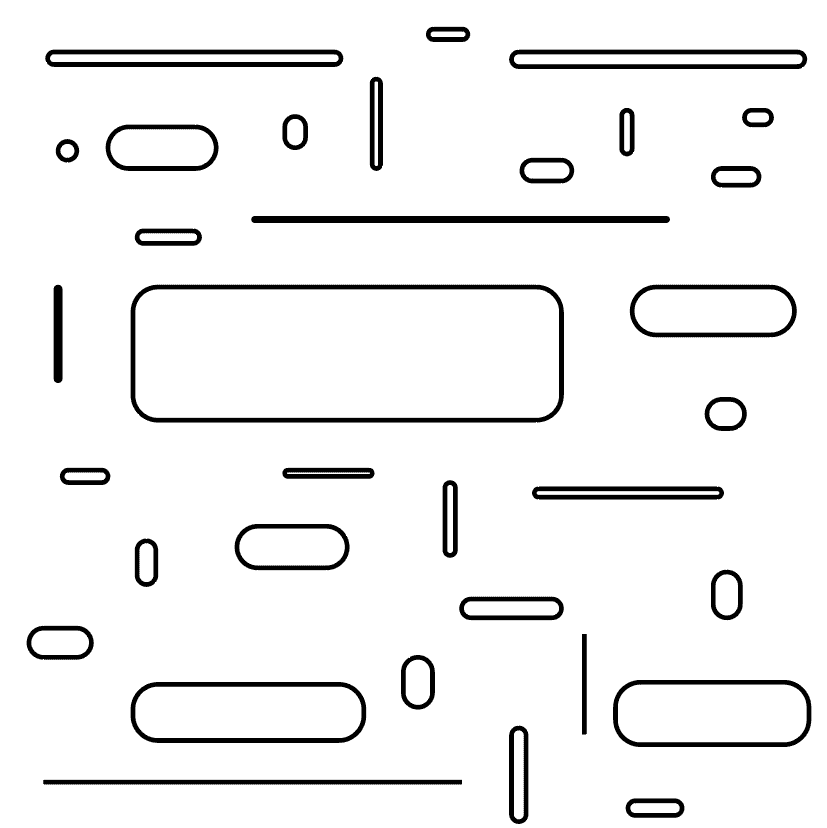
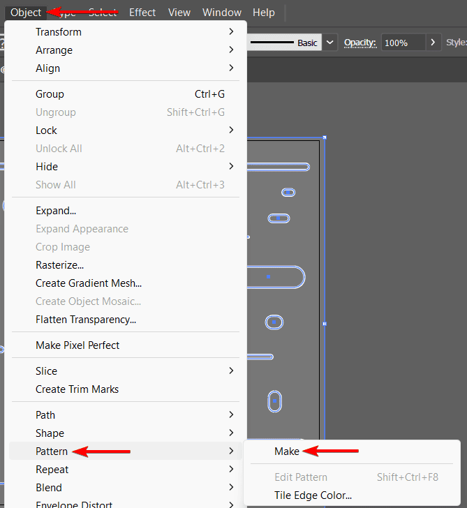
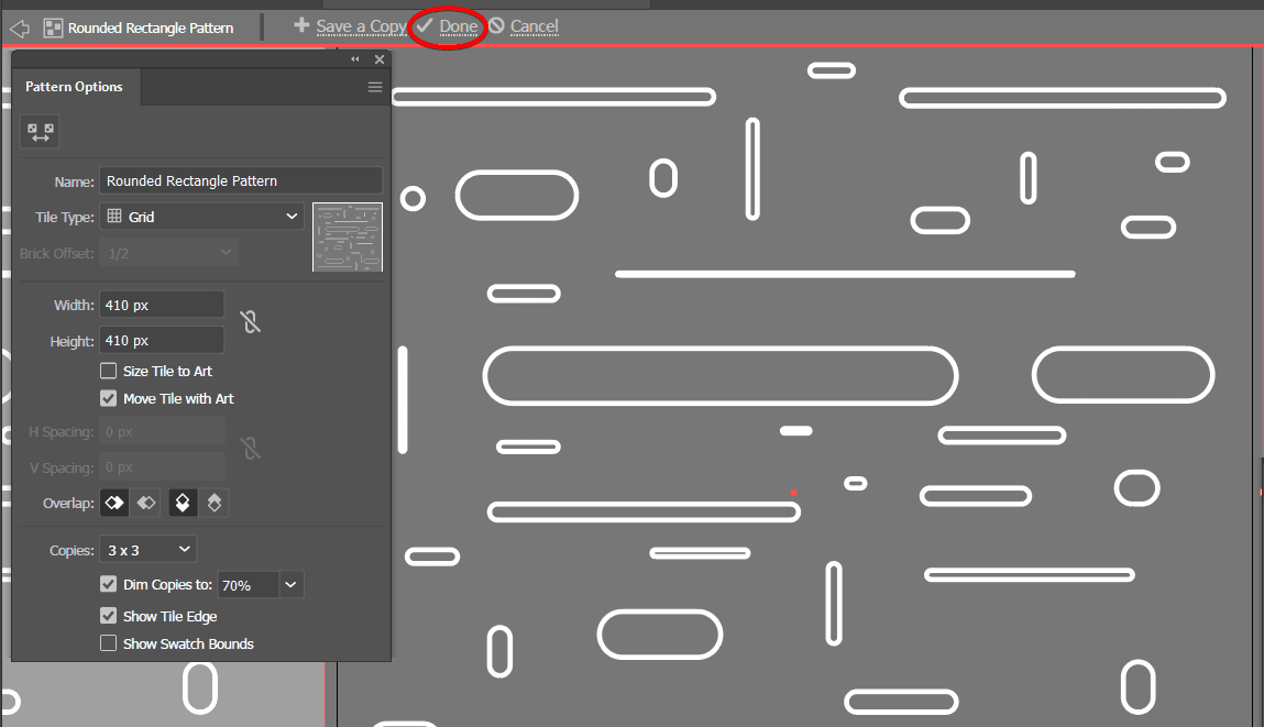
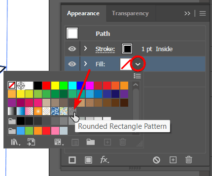
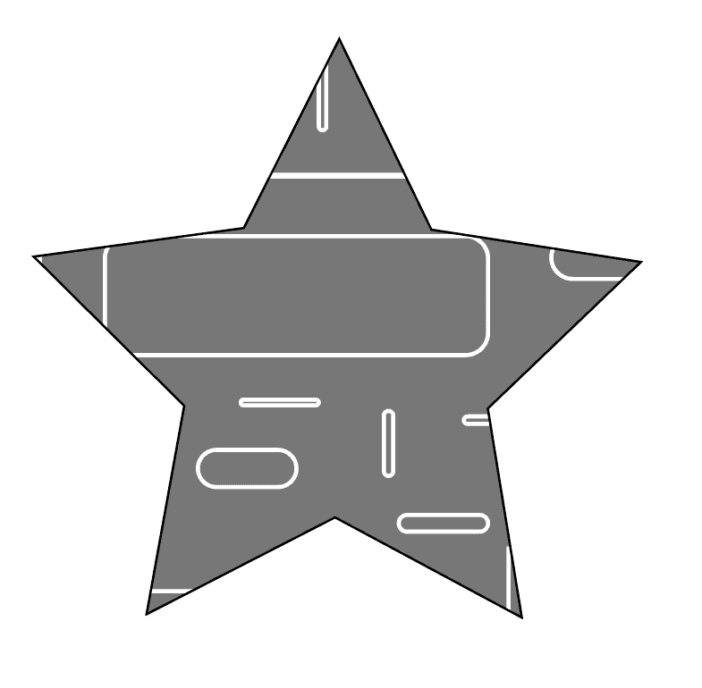
Draw a small original shape (a star, a leaf, a simple icon) and convert it to a symbol (Window > Symbols, then drag your shape into the panel). Place 8-10 instances of it scattered across the artboard at different sizes. Double-click the master symbol to edit it, change its color, and confirm every placed instance updated. Separately, define a small repeating shape as a pattern swatch and fill a large rectangle with it.
Illustrator's Layers panel works more like Photoshop's than InDesign's — layers here typically organize the stacking and grouping of objects within a single artboard's worth of artwork, rather than acting as a document-wide category system across many pages.
| Layer | A stackable container for organizing and grouping objects by front-to-back order and category. |
| Sublayer | A nested layer inside another layer, used to organize complex artwork into clear, collapsible groups. |
| Layer Visibility / Lock | Toggling a layer's content to be hidden or protected from accidental edits. |
| Template Layer | A locked, dimmed, non-printing layer — commonly used to hold a placed reference image (like a scanned sketch) to trace over without it interfering with the final artwork. |
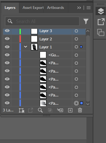
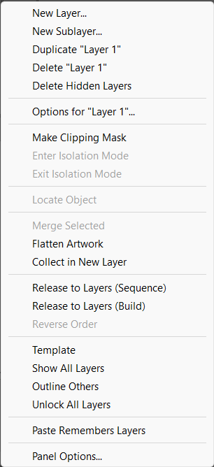
Place a scanned sketch on its own layer, then convert that layer to a Template Layer (Layers panel menu > Template) — it automatically locks, dims to about 50% opacity, and is excluded from printing/export. Draw the final vector artwork on a separate layer above it, tracing the dimmed sketch as a guide, with zero risk of accidentally selecting or editing the reference image itself.
Place any reference image and convert its layer to a Template Layer. Create a new layer above it and use the Pen tool (previewed here, covered fully in Chapter 4) to trace a simple shape from the reference. Organize your final artwork into 2-3 named sublayers (e.g., "Outlines," "Colors," "Details").
Looking ahead: Chapter 4 is where Illustrator's real core skill lives — the Pen tool, paths, and text, the tools that actually build original vector artwork rather than just organizing it.
Chapter Four
04
This is the chapter most people think of when they think of Illustrator: the Pen tool, precise paths, and building original artwork from scratch. It's genuinely a skill that takes real practice to get comfortable with — expect this chapter's exercises to take longer than earlier ones.
Covered here: creating objects and paths, modifying them after the fact, and adding and modifying text — which in Illustrator, unlike InDesign, is treated as just another kind of path-based object.
Every piece of Illustrator artwork starts as either a basic shape (rectangle, ellipse, polygon, star) or a custom path built with the Pen tool — and real illustration work usually combines both.
| Shape Tools | Rectangle, Ellipse, Polygon, and Star tools — draw basic geometric shapes with adjustable, often numeric, parameters. |
| Pen Tool | Draws custom paths point by point, using straight clicks (corner points) or click-and-drag (smooth, curved points). |
| Curvature Tool | A more intuitive, simplified alternative to the Pen tool for drawing smooth curves, adjusting the curve live as points are placed. |
| Open Path / Closed Path | An open path has two distinct endpoints (like a line); a closed path connects back to its own starting point (like a shape's outline). |
| Shape Builder Tool | Merges, subtracts, or divides overlapping shapes by simply dragging across the areas to combine or remove. |
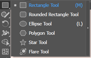
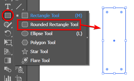
A single click with the Pen tool places a straight corner point. Clicking and dragging instead places a smooth point, pulling out direction handles that control the curve on either side of it — the exact same direction-handle concept from Book Three's Photoshop chapters, just now the primary tool of an entire program rather than one feature among many. Most real Pen tool practice is really about controlling those direction handles predictably: how far you drag determines how "wide" the curve is, and the angle you drag at determines its direction.
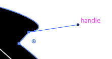
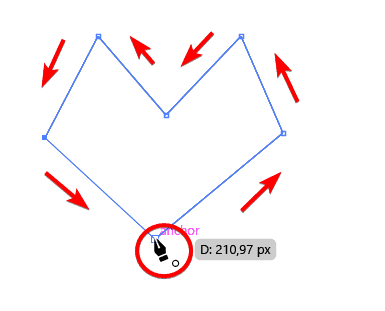
To finish a closed path (needed for anything that's going to have a fill, like a logo shape), the last click needs to land exactly back on the very first anchor point — the cursor shows a small circle icon when it's positioned correctly to close the path. Clicking anywhere else and pressing Escape instead leaves an open path, which won't fill the way a closed shape does.
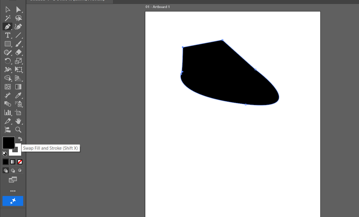
A heart is a genuinely good Pen tool practice shape — two smooth curves, one sharp corner point at the bottom, and a dip at the top that mixes both point types in one small path.
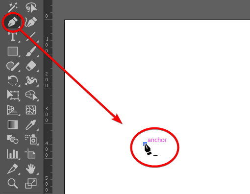

Draw a simple wavy line freehand. Then, on a second attempt, mark only 4-5 dots along a similar wave path and connect them with smooth, deliberate curves — noticing how few points it actually takes to describe a smooth curve, which is exactly the skill the Pen tool is teaching.
Using only the Pen tool, trace a simple leaf or teardrop shape: 2 smooth points (click-drag) forming the two curved sides, closed back to the start. Once closed, apply a fill color and confirm it fills correctly. Then draw an open path (a simple zigzag line, all corner points, never closing it) and apply a stroke to it instead of a fill.
Once a path exists, Illustrator offers precise tools for adjusting it further — adding or removing points, combining shapes mathematically, and reshaping without starting over.
| Pathfinder | A panel of shape-combining operations (Unite, Minus Front, Intersect, Exclude) that mathematically combine two or more overlapping shapes into one new path. |
| Add/Remove Anchor Point | Tools for inserting a new anchor point along an existing path, or deleting one, without breaking the path. |
| Convert Anchor Point Tool | Switches a specific anchor point between a corner point and a smooth point after the fact. |
| Offset Path | Creates a new, larger or smaller path that follows the exact contour of an existing one, at a set distance. |
| Compound Path | Multiple separate paths treated and filled as one combined object — used, for example, to cut a letter's counter (the hole in an "O" or "A") out of its outer shape. |
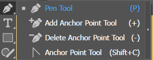
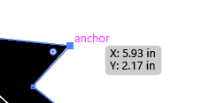
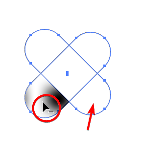
A surprisingly large share of real logo and icon work never touches the Pen tool at all — it's built entirely from overlapping basic shapes (circles, rectangles) combined and subtracted using Pathfinder. A crescent moon icon, for example, is just two overlapping circles with one subtracted from the other (Minus Front) — faster and more precisely geometric than trying to hand-draw the same curve with the Pen tool.
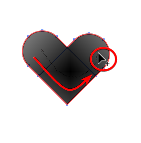
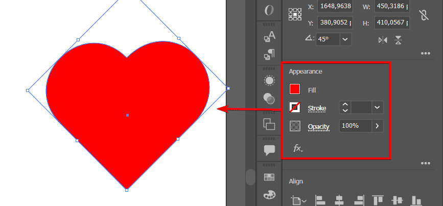
Compare this to the hand-drawn heart from 4.1: the exact same silhouette, built instead from a rotated rounded square plus circles, unioned together with the Shape Builder tool — no Pen tool curves at all.
Draw two overlapping circles. Using the Pathfinder panel, create 4 separate versions: one using Unite, one using Minus Front, one using Intersect, and one using Exclude. Line all 4 results up side by side and label each with which Pathfinder operation produced it.
Build the heart icon shown above: a rounded square rotated 45°, with two circles (or rounded shapes) positioned over its top two edges. Use the Shape Builder tool to merge everything into one shape. Then build the same heart silhouette a second way, entirely with the Pen tool from 4.1. Which method gave you more control over the exact curve of the top lobes? Which was faster?
Illustrator handles text differently from InDesign: text here is treated fundamentally as artwork — useful for a logo's wordmark, a poster's headline, or a single line of stylized type, but not built for flowing long-form body copy across many linked frames the way InDesign is.
| Point Type | A single click with the Type tool creates text that grows outward as you type, with no fixed frame — suited for short headlines and logos. |
| Area Type | Text contained within a defined shape, wrapping automatically to fit inside it — closer to how InDesign's text frames work. |
| Type on a Path | Text that flows directly along a custom path's curve, rather than in a straight line. |
| Outline Text | Converting live, editable text into pure vector paths — permanently locking its appearance but guaranteeing it displays identically on any computer, even without the original font installed. |
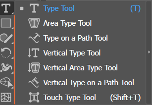
Before sending a finished logo or artwork file to a client or printer, text is almost always outlined (Type > Create Outlines). This permanently converts the live text into ordinary vector shapes — it can no longer be edited as text (so this is done after all copy is finalized, and always on a duplicate, keeping an editable version too), but it guarantees the file displays exactly as designed on any computer, regardless of whether that computer has the original font installed.
Create a short wordmark using Point Type. Draw a circular path and add a second copy of your text as Type on a Path, flowing around the circle. Duplicate your original wordmark, and on the duplicate only, use Type > Create Outlines — then try selecting a single letter with the Direct Selection tool and confirm it now behaves like a vector shape, not editable text.
Once text exists, Illustrator offers the same core typographic controls as InDesign, plus vector-specific ways of further transforming it as artwork.
| Character Panel | Controls font, size, kerning, tracking, and leading — the same core typography settings from earlier in this series. |
| Paragraph Panel | Controls alignment, indents, and spacing for Area Type. |
| Character/Paragraph Styles | Saved, reusable text formatting, working the same way as InDesign's styles from Book Four. |
| Envelope Distort | Warps text (or any object) to fit a preset shape or a custom mesh, while keeping it live and re-editable as text. |
| Touch Type Tool | Selects and transforms individual letters within a live text string — repositioning, rotating, or resizing one character without outlining the whole thing. |
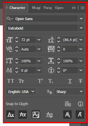
Dragging a text object's corner handle with the plain Selection tool doesn't just resize it — it stretches the Horizontal Scale and Vertical Scale values in the Character panel, distorting the letterforms away from the type designer's original proportions. It's an easy mistake to make and a genuinely common one to see in real student and even professional work.
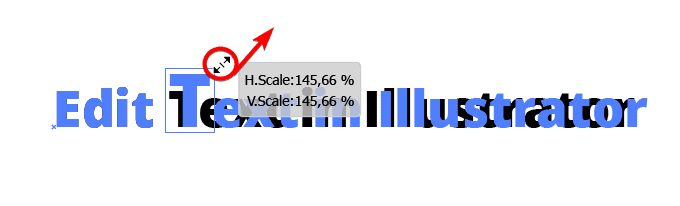
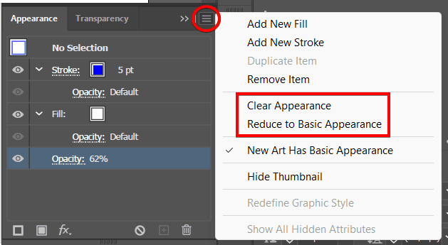
With the distorted text selected, either reset Horizontal Scale and Vertical Scale back to 100% directly in the Character panel, or open the Appearance panel's menu and choose Reduce to Basic Appearance to strip the distortion back to the object's real, undistorted state. Either way, the safer habit going forward is resizing text with the corner handle while holding Shift (constrains proportions) or, better, changing the point size in the Character panel directly instead of dragging at all.
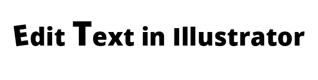
Outlining text (4.3) locks it permanently as shapes. Envelope Distort is different: it warps text visually (into an arc, a wave, a custom shape) while keeping the underlying text fully live and editable — double-click back into it, fix a typo, and the warp reapplies automatically to the corrected text. This is the better choice whenever text might still need editing after the warp effect is applied.
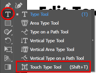
Type a short headline, then drag its corner handle with the plain Selection tool until it visibly distorts. Check the Character panel to confirm Horizontal/Vertical Scale moved away from 100%, then fix it using both methods from this section: once via the Character panel's scale fields, once via Reduce to Basic Appearance on a second copy. Then apply Envelope Distort (Object > Envelope Distort > Make with Warp) using an Arc style to a fresh line of text. Double-click back into it, change one word, and confirm the arc warp automatically reapplies. Finally, use the Touch Type tool to individually rotate and resize just the first letter of your headline.
Looking ahead: Chapter 5 covers refining what you've built — selections, appearance and AI features, opacity and masks, and precise object positioning.
Chapter Five
05
With the core building skills from Chapter 4 in place, this chapter covers refining and finishing artwork: selecting exactly what you mean to, adjusting how it looks (including Illustrator's real generative AI tools), controlling transparency, and positioning everything with real precision.
Covered here: selections, modifying appearance (and AI features), opacity and masks, and positioning objects.
Beyond the basic Selection and Direct Selection tools from Chapter 3, Illustrator offers several ways to select groups of objects by shared property rather than clicking each one individually.
| Select Same | Selects every object in a document sharing a specific property (fill color, stroke weight, font) with the currently selected one. |
| Magic Wand Tool | Selects objects with similar fill color by clicking, with an adjustable tolerance. |
| Lasso Tool | Freehand-draws a selection area, selecting any anchor points or objects it encloses. |
| Group Selection | Selecting an entire group as one unit, or clicking again to select just one object within it, without ungrouping. |
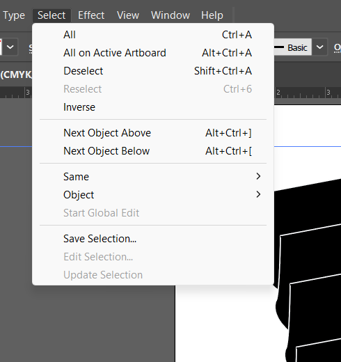
Imagine an icon set with 20 icons, and a client asks to change every icon that currently uses a specific accent color. Rather than manually clicking through all 20 to find which ones qualify, select one object using that color, then Select > Same > Fill Color — every object sharing that exact fill, across the whole document, gets selected instantly.
Draw 10 shapes using only 3 different fill colors, scattered and overlapping. Click one shape and use Select > Same > Fill Color to select every shape sharing that color. Group a few shapes together, then practice both selecting the whole group at once and clicking again to select just one object inside it.
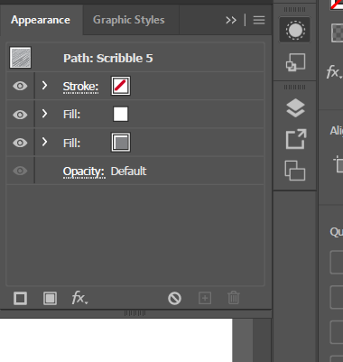
The Appearance panel is where Illustrator's non-destructive editing philosophy lives — and it's also where Illustrator's Firefly-powered generative AI tools show up directly in a designer's workflow.
| Appearance Panel | Shows every fill, stroke, and effect applied to a selected object, in order, all independently editable or removable at any time. |
| Effect | A non-destructive visual modification (a rounded corner, a drop shadow, a distortion) applied on top of an object's base path, without altering the underlying path itself. |
| Text to Vector Graphic | Firefly's vector-specific generative AI model, generating fully editable vector artwork (icons, scenes, patterns) directly from a text prompt. |
| Generative Recolor | Recolors existing artwork using a text-prompted mood or theme (e.g., "midnight in the jungle"), generating several coordinated color-theme options at once. |
| Generative Expand | Extends existing artwork or imagery beyond its current edges, filling a larger area with plausible generated content. |
Most AI image generators output a flat raster image. Illustrator's Text to Vector Graphic, powered by Adobe's Firefly Vector Model, generates results as real, editable vector paths from the start — meaning the output can be recolored, resized to any dimension with no quality loss, and edited with the Direct Selection tool exactly like hand-drawn artwork, not just a flat picture that happens to look vector-ish.
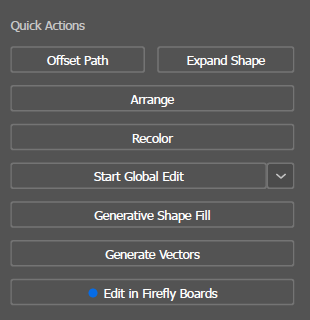
Same standing rule from The Layout Path: a client project using AI-generated artwork still needs honesty about what was AI-generated and the client's explicit comfort with that, before it's used in paid work.
Using Text to Vector Graphic, generate a simple icon from a written prompt. Select the result with the Direct Selection tool and confirm it behaves as real, editable vector paths (try moving one anchor point). Apply Generative Recolor to test at least 3 different mood-based color themes on the same artwork, and screenshot/compare the results.
Controlling transparency and using masks to selectively reveal or hide parts of artwork are essential for layered, polished vector illustration.
| Opacity | An object's transparency level, adjustable per-object in the Transparency panel. |
| Blend Mode | Controls how an object's color mathematically combines with whatever sits beneath it — same core concept from earlier books. |
| Clipping Mask | Uses the topmost selected object's shape to crop/reveal only the portion of the artwork beneath it that falls within that shape. |
| Opacity Mask | Uses a separate object's grayscale values to control transparency across another object — white areas stay fully visible, black areas become fully transparent, gray areas partially transparent. |
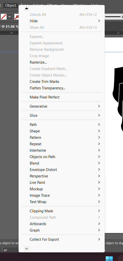
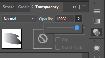
A clipping mask gives a hard, sharp-edged crop — the shape either shows or doesn't, with no in-between. An opacity mask gives a soft, gradual crop, because it reads grayscale values rather than a simple shape boundary — useful for a photo that needs to fade smoothly into transparency at its edges rather than being cut off sharply.
Place an image and draw a star shape on top of it. Select both and apply a Clipping Mask (Object > Clipping Mask > Make) — confirm only the star-shaped portion of the image remains visible. Separately, apply a black-to-white gradient as an opacity mask to a second copy of the same image (Transparency panel > make mask), and confirm it fades smoothly rather than cutting off sharply.
The final domain covers precise, reliable object placement — essential for anything that needs consistent spacing or exact alignment, from an icon set to a multi-artboard layout.
| Align Panel | Aligns and evenly distributes selected objects relative to each other, the artboard, or a specific key object. |
| Arrange | Controls an object's front-to-back stacking order (Bring to Front, Send to Back, and the steps between). |
| Transform Panel | Numeric X/Y position, width/height, and rotation fields for exact object placement. |
| Align to Pixel Grid | Snaps an object's edges to whole-pixel boundaries, keeping edges crisp for anything ultimately headed to screen display. |
Aligning several objects to the same horizontal center is one job; making the gaps between them perfectly even is a genuinely different one — that's what the Align panel's Distribute Spacing options do specifically, and eyeballing consistent gaps by hand is notoriously unreliable compared to letting Illustrator calculate them exactly.
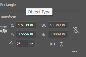
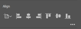
Dragging a rotate handle by eye is exactly as imprecise as dragging an object to a position by eye — and Object > Transform offers the same numeric-field fix for both rotating and mirroring an object.
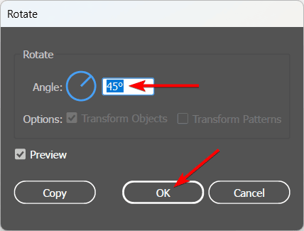
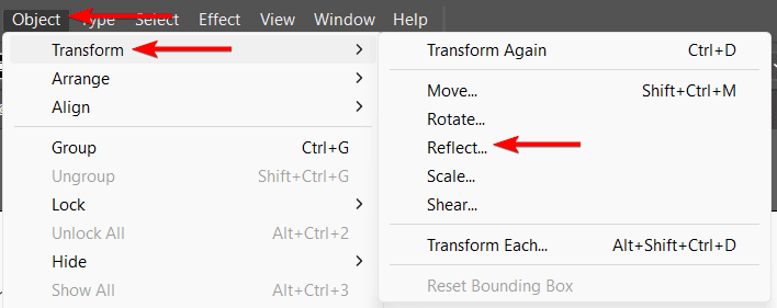
Scatter 5 identical small shapes randomly across an artboard. Select all 5 and use the Align panel to align them to the same vertical center, then use Distribute Spacing to make the horizontal gaps between them perfectly even. Select one and use the Transform panel to move it to an exact numeric X/Y position.
Looking ahead: Chapter 6 closes the book with the exam itself.
Chapter Six
06
Everything in Chapters 1–5 maps directly to the real, current Adobe Certified Professional exam for Illustrator — this short closing chapter is about the exam itself.
The 5 domains this book is built around — Working in the Design Industry, Document Management, Workflow and Interface Customization, Working with Objects Paths and Text, and Modifying Object Appearance and Position — are Adobe's own real, current exam blueprint, verified directly against certifiedprofessional.adobe.com/illustrator.
Like the Photoshop and InDesign exams, Illustrator's exam runs through Certiport's Compass testing engine as a Live-in-the-Application (LITA) exam — short, timed tasks completed directly inside a real, running copy of Illustrator, rather than multiple-choice questions about screenshots. The exact number of questions, time limit, and passing score weren't published on the general exam-overview pages checked while writing this book — always confirm the current, exact numbers directly at certiport.pearsonvue.com.
As with the other books in this series: GMetrix is the practice platform most schools use to rehearse, and its practice-test style can feel a little different from the live, inside-Illustrator Compass format of the real exam — practice both vocabulary fluency and actual tool speed.
The same two accounts from every exam in this series — set both up early.
Because this is a task-based exam, effective preparation combines vocabulary fluency (every glossary term across all 5 chapters, cold, no notes) with real tool speed (redo every "Try It: In Illustrator" exercise from memory, without looking back at the instructions, until it's fast and automatic). Pen tool control specifically deserves extra deliberate practice beyond the book's exercises — it's the one skill in this book that genuinely separates comfortable from uncomfortable on exam day, and it only comes from repetition.
That's the whole book. Six chapters, five real exam domains, the same structure as the rest of this series: concept first, vocabulary next, hands-on practice last. Between this book, The Digital Path, and The Layout Path, the three core Adobe design tools this program is built around are now covered start to finish.
Back Matter
Every fact, tool description, and exam detail in this book was checked against a real, named source. This section collects all of them in one place, organized by how they were used.
| Adobe Certified Professional Exam Objectives1 | “Graphic Design & Illustration Using Adobe Illustrator,” published by Certiport, a business of NCS Pearson, Inc. The authoritative source for this book's 6 core chapters and their exact domain breakdown, verified September 2026. |
| Adobe Illustrator Help2 | Adobe's own official documentation site — the authoritative reference for verifying interface facts, menu paths, dialog names, and terminology throughout this book, including Chapter 5.2's Firefly-powered generative AI features. |
| Adobe Education Exchange | Publicly shared classroom curriculum used as a topic map confirming what Illustrator's real feature set covers — artboards, the Pen tool, symbols and patterns, Image Trace, masks — never copied as text into this book. |
| Additional teacher-verified reference material | A short introductory Illustrator handout and Adobe's own published Illustrator help/worksheet material were used strictly as private accuracy checks against this book's glossary and menu descriptions, never copied into the public text. |
Every figure in this book is a real, unedited screenshot captured directly from a current Illustrator install by this teacher, specifically to illustrate this edition — the New Document and Artboard Options dialogs, a full Image Trace workflow from a placed photo through Expand, two real worked examples of building the same heart icon (once with the Pen tool, once with Shape Builder), a full custom Pattern swatch workflow from source art to applied fill, the Swatches, Gradient, Brushes, Symbols, Graphic Styles, and Layers panels, the Select menu and Clipping Mask/Transparency panel, the Character panel and a real text-distortion-and-fix sequence, the Touch Type tool, and more. No screenshot in this book was sourced from any outside party, a tutorial, or Adobe's own marketing material.
▸ See the Preface at the front of this book for this edition's full license and terms of free use.